
Bar Graphs
Important Questions on Bar Graphs
Number of students in seven classes of a school is given below
| Class | |||||||
| Number of students |
Represent the data on a bar graph
The following data gives the information about the favourite fruit of students of class in a particular school.
Represent the data on a bar graph using a suitable scale.
| Favourite fruit | Apple | Banana | Mango | Grapes | Orange |
| Number of students |
The following data gives the total marks (out of ) obtained by six children of a particular class.
Represent the data on a bar graph using a suitable scale.
| Students | Ramu | Manjit | Venkat | Shehzad | Manisha | Aarthi |
| Marks obtained |
Observe the below given bar graph which is showing the scale of shirts in a ready-made clothes shop from Monday to Saturday.

How many shirts were sold on Thursday?
Observe the below given bar graph which is showing the scale of shirts in a ready-made clothes shop from Monday to Saturday.
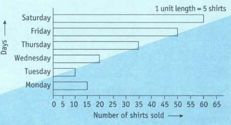
On which day were the minimum number of shirts were sold?
Observe the below given bar graph which is showing the scale of shirts in a ready-made clothes shop from Monday to Saturday.

On which day maximum number of shirts were sold? How many shirts were sold on that day?
Observe the below given bar graph which is showing the scale of shirts in a ready-made clothes shop from Monday to Saturday.
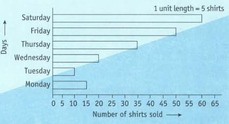
What is the scale chosen on horizontal line representing the number of shirts.
Observe the below given bar graph which is showing the scale of shirts in a ready-made clothes shop from Monday to Saturday.

What information does the bar graph gives?
The height of some tall structures in the world is given as follows.
| Structure | Country | Height in Metres |
| Empire State Building | USA | |
| Delhi TV Tower | India | |
| Telecom Tower | Great Britain | |
| Eiffel Tower | France |
Represent the above data by drawing a bar graph with appropriate scale.
A survey was conducted in a class to find the preference of students for fruit drinks and the following tally was collected.
Complete the data by filling the third column and then draw a bar graph with the appropriate scale.
| Fruit Juice | Students who preferred | Number of students who preferred |
| Apple | ||
| Orange | ||
| Mango | ||
| Pomegranate | ||
| Sugarcane |
The mode of transportation used by students of a school is as follows:
| Modes of transportation | School bus | Private bus | Private van | Auto | Metro | On foot | Cycle |
| Number of students |
Draw a bar graph to represent the above data.
The following table shows the earnings of Mehra and Sons Pvt.Ltd. (in ₹ lakhs) during four consecutive financial years.
| Year | ||||
| Earning (in ₹ lakhs) |
Draw a bar graph representing the above data.
The number of shirts manufactured in a factory during six consecutive months is given below.
| Month | March | April | May | June | July | August |
| Number of shirts manufactured |
Draw a bar graph representing the above information.
The following table represents the enrolment of new students in a school for five consecutive years.
| Years | |||||
| Number of students |
Draw a bar graph to represent the given data.
The population of six Indian states as estimated in the year is given below.
| State | Bihar | Jharkhand | Uttar pradesh | Uttarakhand | Madhya Pradesh | Chattisgarh |
| Population (in lakhs) |
Draw a bar graph to represent the above data.


