
Circle Graph or Pie Chart
Important Questions on Circle Graph or Pie Chart
The following data represents the number of students got admission in different streams of a college:
|
Stream |
Science |
Arts |
Commerce |
Law |
Management |
|
Number of students |
|
|
|
|
|
Draw a pie chart to represent this data.
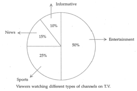
Answer the following questions based on the pie chart given below:
Which two types of programmes have number of viewers equal to those watching sports channels
The following data represents the percentage distribution of the expenditure incurred in publishing a book.
|
Items |
Paper cost |
Printing cost |
Binding |
Royalty |
Transportation cost |
Promotion cost |
|
Expenditure (in ) |
|
|
|
|
|
|
Draw a pie chart to represent this data.
Answer the following questions based on the pie chart given below:
Which type of programmes are viewed the least

Answer the following questions based on the pie chart given below:
Which type of programmes are viewed the most

The following data represents the number of students using a different mode of transportation to come to school.
| Mode of transport | Bicycle | School bus | Car | Walking |
| Number of students |
Draw a pie chart to represent this data.
The following data represents the monthly expenditure of a family (in ) on various items. Draw a pie chart to represent this data.
|
Items |
Food |
House rent |
Education |
Savings |
Health |
Others |
|
Expenditure (in ) |
|
|
|
|
|
|
The following data represents the different number of animals in a zoo. Prepare a pie chart for the given data.
|
Animals |
Deer |
Tiger |
Elephant |
Giraffe |
Reptiles |
|
Number of animals |
|
|
|
|
|
The adjoining pie chart shows the expenditure of a country on various sports during year . Study the pie chart carefully and answer the following question:

If the total amount spent on sports in is then find the amount spent on cricket and hockey together.
The adjoining pie chart shows the expenditure of a country on various sports during year . Study the pie chart carefully and answer the following question:

If the total amount spent on sports in is , then find the amount spent on Badminton.
The adjoining pie-chart shows the expenditure of a country on various sports during year . Study the pie chart carefully and answer the following question:

How much percent more is spent on hockey than that on tennis?
The adjoining pie chart shows the expenditure of a country on various sports during the year . Study the pie chart carefully and answer the following question:
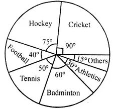
What percent of the total expenditure is spent on cricket?
The adjoining pie chart shows the number of students enrolled in class to class of a school.

If students are enrolled from to , then answer the following question:
How many students are enrolled in class ?
The adjoining pie chart shows the number of students enrolled in class to class of a school.

If students are enrolled from to , then answer the following question:
Find the ratio of students enrolled in to students enrolled in .
The adjoining pie chart shows the number of students enrolled in class to class of a school.
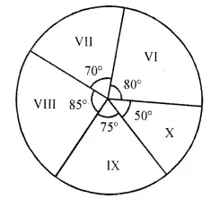
If students are enrolled from to , then answer the following question:
What is the sum of students enrolled in and ?
The adjoining pie chart shows the number of students enrolled in class to class of a school.
If students are enrolled from to , then answer the following question:
How many students are more in class than in class
Draw a pie chart of the data given below:
The time spent by a class student during a day.
| Sleep | School | Tution | Self study | Play | Others |
| 7 Hrs | 6 Hrs | 2 Hrs | 2 Hrs | 4 Hrs | 3 Hrs |
Should a student of class study for just hours daily? Which time is considered the best time for self- study
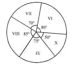
The pie graph shown in the adjoining figure representing the different subjects liked by the students of class . 
Number of students who like Science is
The pie graph shown in the adjoining figure representing the different subjects liked by the students of class .
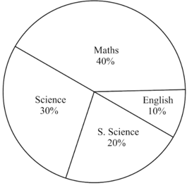
If there are students in class , then the number of students who like S. Science is
The pie graph shown in the adjoining figure representing the different subjects liked by the students of class .
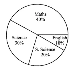
Which subject is liked by the minimum number of students


