
Bar Graph
Important Questions on Bar Graph
Given below is a bar graph showing the heights of five mountain peaks.

Arrange the given heights of peak in the descending order
Given below is a bar graph showing the heights of five mountain peaks.
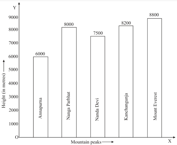
What is the ratio of the highest peak and the next highest peak?
Given below is a bar graph showing the heights of five mountain peaks.
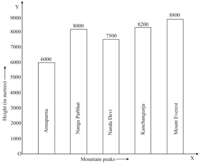
What is the ratio of the highest peak and the next highest peak?
In a survey or families of a colony, the number of members in each family was recorded, and the data has been represented by the following bar graph.
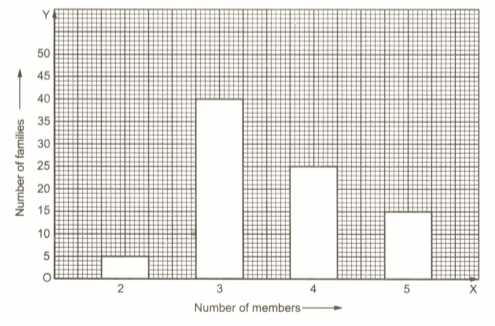
Which type of family is the most common? How many members are there in each family of this kind?
In a survey or families of a colony, the number of members in each family was recorded, and the data has been represented by the following bar graph.
How many people live alone?
In a survey or families of a colony, the number of members in each family was recorded, and the data has been represented by the following bar graph.
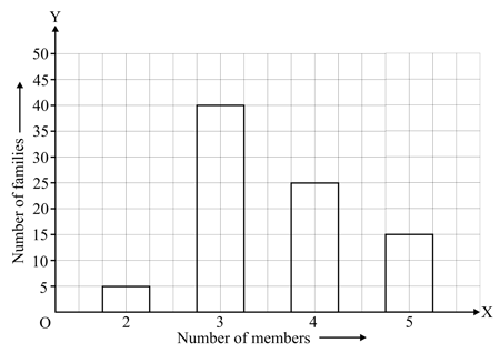
How many families have members?

What is the average marks obtained by the student?
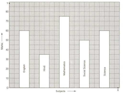

In which subject is the student very good?
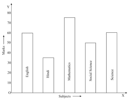
What information does the bar graph give?
In a public library, the librarian made the following observations in a particular week.
| Days | Monday | Tuesday | Wednesday | Thursday | Friday | Saturday |
| Newspaper reader | ||||||
| Magazine reader |
(i) Draw a double bar graph choosing an appropriate scale.
(ii) On which day, the number of readers in the library was maximum?
(iii) What is the mean number of magazine readers per day.
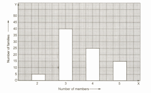
In a survey or families of a colony, the number of members in each family was recorded, and the data has been represented by the following bar graph.
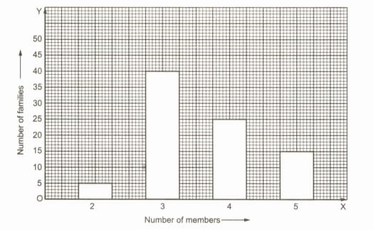
What information does the bar graph give?
Various modes of transport used by students of a school are given below. Draw a bar graph to show this information
| School bus | Private bus | Bicycle | Rickshaw | By foot |
Gold prices on Consecutive Tuesdays were as under. Draw a bar graph to show this information.
| Week | First | Second | Third | Fourth |
| Rate per |
The following table shows the market position of different brands of soaps. Draw a bar graph to represent this data.
| Brand | A | B | C | D | Others |
| Percentage of buyers |
The data given below shows the average rainfall in Udaipur from June to November of a certain year. Draw a bar graph to represent this information.
| Month | June | July | August | September | October | November |
| Average rainfall |
The following table shows the imports (in thousand crore rupees) made by India over the last five years. Draw a bar graph to represent this data.
| Year | |||||
| Imports (in a thousand crore rupees) |
The following table shows the life expectancy (average age to which people live) in various countries in a particular year. Represent this data by a bar graph.
| Country | Japan | India | Britain | Ethiopia | Cambodia |
| Life expectancy (in years) |
The air distances of four cities from Delhi (in km) are given below. Represent the data by a bar graph.
| City | Kolkata | Mumbai | Chennai | Hyderabad |
| Distance from Delhi (in km) |
The following table shows the interest paid by India (in a thousand crore rupees) on external debts during the period to . Represent the data by a bar graph.
| Year | ||||
| Interest (in thousand crore rupees) |


