Introduction
Introduction: Overview
This topic states that graphical approaches are used to display data and useful in arranging and interpreting data. Graphs are visual representations of the collected data. It aims to display numerical data in physical form for quick understanding.
Important Questions on Introduction
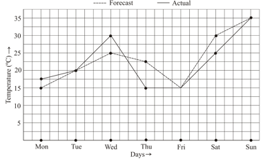
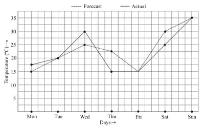
The following graph shows the temperature forecast and the actual temperature for each day of a week.
On which days was the forecast temperature the same as the actual temperature.
The following graph shows the temperature of a patient in a hospital, recorded every hour.
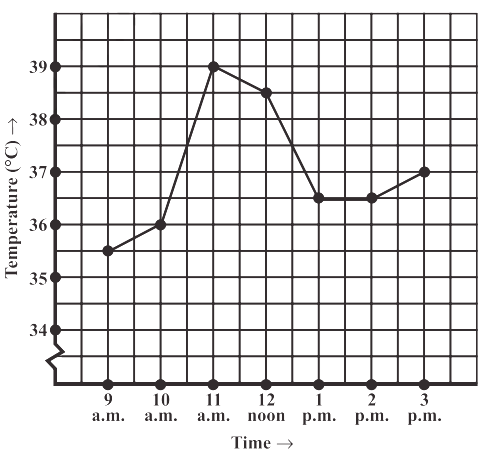
The patient’s temperature was the same two times during the period given. What were these two times?
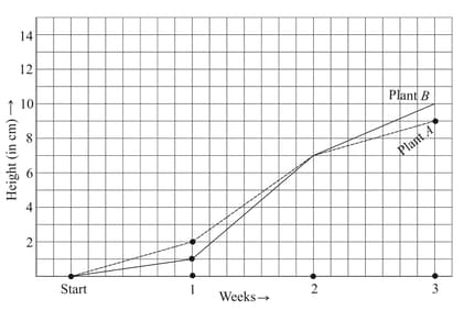
For an experiment in Botany, two different plants, plant and plant were grown under similar laboratory conditions. Their heights were measured at the end of each week for weeks. The results are shown by the following graph.
How high was Plant after (i) weeks (ii) weeks?
Can there be a time-temperature graph as follows? Justify your answer.
Can there be a time-temperature graph as follows? Justify your answer.
Can there be a time-temperature graph as follows? Justify your answer.
A courier-person cycles from a town to a neighbouring suburban area to deliver a parcel to a merchant. His distance from the town at different times is shown by the following graph. If he rides fastest during to find ?
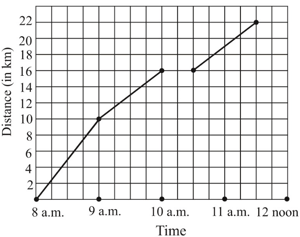
A courier-person cycles from a town to a neighbouring suburban area to deliver a parcel to a merchant. His distance from the town at different times is shown by the following graph.
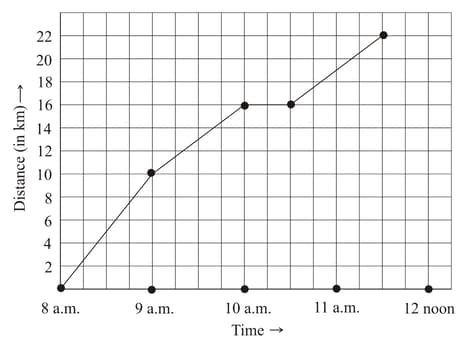
If the distance of the place of merchant from the town is , write as the final answer.
A courier-person cycle from a town to a neighbouring suburban area to deliver a parcel to a merchant. His distance from the town at different times is shown by the following graph.

If the person took hours to travel, write the value of as the final answer.
A courier-person cycle from a town to a neighbouring suburban area to deliver a parcel to a merchant. His distance from the town at different times is shown by the following graph.
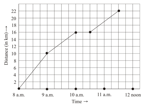
If the scale for the time axis is , then find the value of .
Use the table for population (in thousands) of men and women in a village in different years, to draw a linear graph:
| Year | |||||
|---|---|---|---|---|---|
| Number of Men | |||||
| Number of Women |
The following graph shows the temperature forecast and the actual temperature for each day of a week. On which day did the actual temperature differ the most from the forecast temperature?
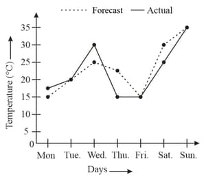
The following graph shows the temperature forecast and the actual temperature for each day of a week.
If the minimum actual temperature during the week was , then find the value of .
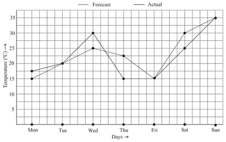
The following graph shows the temperature forecast and the actual temperature for each day of a week.
If the maximum forecast temperature during the week was , then find .
For an experiment in Botany, two different plants, plant and plant were grown under similar laboratory conditions. Their heights were measured at the end of each week for weeks. The results are shown by the following graph.
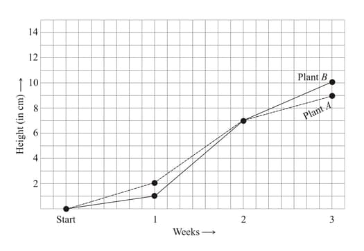
Write the correct answer from the given options: week.
During which week did Plant grow least?
For an experiment in Botany, two different plants, Plant and Plant were grown under similar laboratory conditions. Their heights were measured at the end of each week for weeks. The results are shown by the following graph. If the growth of Plant was the most in Week , then write the value of .
For an experiment in Botany, two different plants, plant and plant were grown under similar laboratory conditions. Their heights were measured at the end of each week for weeks. The results are shown by the following graph.
If the plant grew from the end of the week to the end of the week by , then find the value of .
For an experiment in Botany, two different plants, plant and plant were grown under similar laboratory conditions. Their heights were measured at the end of each week for weeks. The results are shown by the following graph.
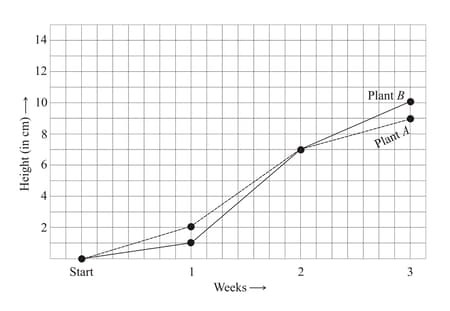
If the height of plant during week is , find .
For an experiment in Botany, two different plants, plant and plant were grown under similar laboratory conditions. Their heights were measured at the end of each week for weeks. The results are shown by the following graph.
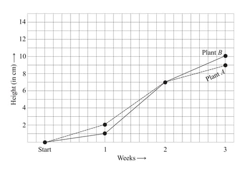
If the height of plant after weeks was , find the value of .
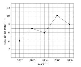
The following line graph shows the yearly sales figures for a manufacturing company.
In which year was there the greatest difference between the sales as compared to its previous year.