
Graphical Representation of Grouped Data
Important Questions on Graphical Representation of Grouped Data
The following histogram shows the number of runs scored by a batsman in one-day matches:

In how many matches did he score less than half a century?
The following histogram shows the number of runs scored by a batsman in one-day matches:

In how many matches did he score or more runs?
The following histogram shows the number of runs scored by a batsman in one-day matches. How many matches were played in the lowest run group?
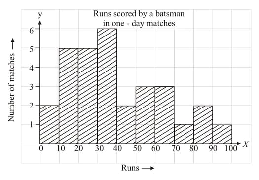
The following histogram shows the number of runs scored by a batsman in one-day matches:
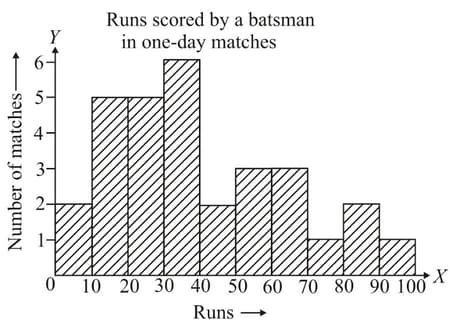
How many matches did batsman play?
What percentage of illiterate females belong to the age group years

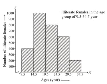
What is the ratio of the number of illiterate females in the age group years to the number of illiterate females in the age group years
Study the histogram given in figure and answer the given question.

What is the total number of illiterate females in the age group years?
Study the histogram given in figure and answer the given question.

How many more illiterate females are there in the age group years as compared to the age group
Study the histogram given in the figure and answer the question.
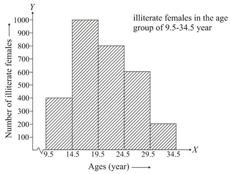
Which age group has the maximum number of illiterate females?
Study the histogram given in the figure and answer the question.
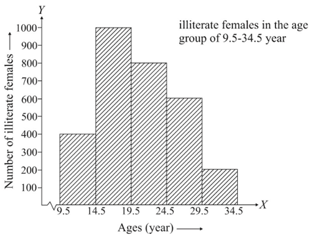
Which age group has the least number of illiterate females?
The histogram of a frequency distribution is shown below. Read the histogram and answer the given question.
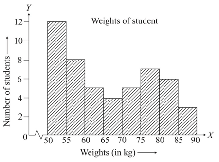
If one more student weighing joins this group, then how many students shall weigh or more?
The histogram of a frequency distribution is shown below. Read the histogram and answer the question.

How many students are in the range
The histogram of a frequency distribution is shown below. Read the histogram and answer the question.
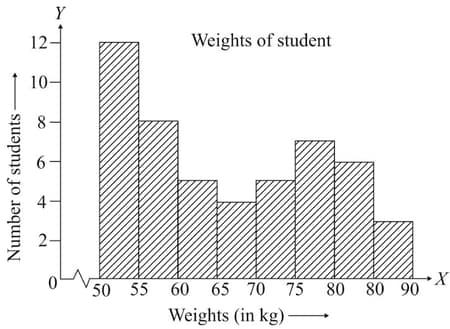
How many students weigh less than
The histogram of a frequency distribution is shown below. Read the histogram and answer the question.
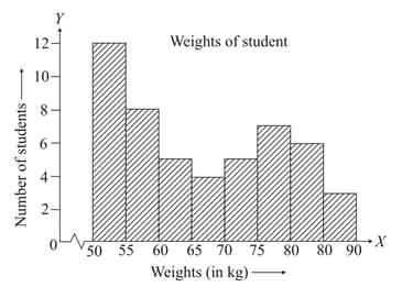
How many students shall weigh or more?
The histogram of a frequency distribution is shown below. Read the histogram and answer the given question.
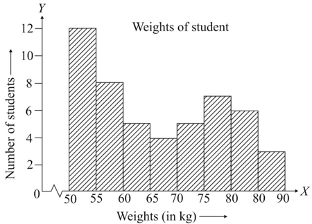
Use the graph to construct a frequency distribution table.
A survey showed that the average daily expenditures (in ) of households in a city were:
Form a frequency distribution using class intervals and so on.
Draw a histogram for the above data.
Draw a histogram to represent the following data:
| Monthly income (in ₹) | |||||
| Number of workers |
Draw a histogram for the following frequency distribution:
| Class interval | ||||||
| Frequency |
A dice was thrown times and the following scores were obtained:
Prepare a frequency distribution table.
The following data shows India's total population (in millions) from to
| Year of Census | |||||||
| Population (in millions) |
Represent the above data by a bar graph.


