
NCERT Solutions for Chapter: Statistics, Exercise 1: Exercise
NCERT Mathematics Solutions for Exercise - NCERT Solutions for Chapter: Statistics, Exercise 1: Exercise
Attempt the practice questions on Chapter 14: Statistics, Exercise 1: Exercise with hints and solutions to strengthen your understanding. Mathematics Textbook of Competency Based Questions for Class IX solutions are prepared by Experienced Embibe Experts.
Questions from NCERT Solutions for Chapter: Statistics, Exercise 1: Exercise with Hints & Solutions
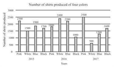
The given graph represents the production of shirts of four colours from three different years with the maximum potential of production of each coloured shirt being for each year. If a fourth year were added, which of the following sets of production would put Pink ahead of White by shirts cumulatively.
The following bar graph shows the results of annual examination in a secondary school.
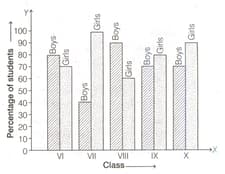
Read the bar graph (shown above) and choose the correct alternative in each of the following.
The sum of pass rate of girls of class X and pass rate of boys of class VI is
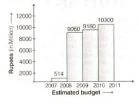
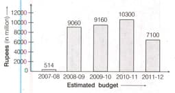
The following bar graph represents the budget allocation by Government of NCT of Delhi under Ladli scheme

This scheme started in Jan 2008. Study the above bar graph and answer the following questions.
Find the year, in which the budget was million.
The following histogram graph represents the budget allocation by Government of NCT of Rajasthan under Devnarayan scheme.
This scheme started in June . Study the above bar graph and answer the following questions. In which year, budget was maximum?
The following table shows the number of literate females in the age group in a village
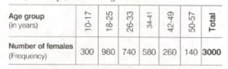
Draw a histogram to represent the given data.
The following bar graph represents the budget allocation by Government of NCT of Delhi under Ladli scheme
This scheme started in Jan 2008. Study the above bar graph and answer the following questions.
Find the year, in which the budget was minium.
students from a locality use different modes of transport to go to school as given below
| Mode of transport | Car | Bus | Moped | Bicycle | Rickshaw |
| Number of students |
Draw the bar graph representing the above data.
The following table gives the distribution of marks of students
| Marks | |||||
| Frequency |
Represent the marks in a frequency polygon.


