
Data was gathered on cyberbullying in a school.
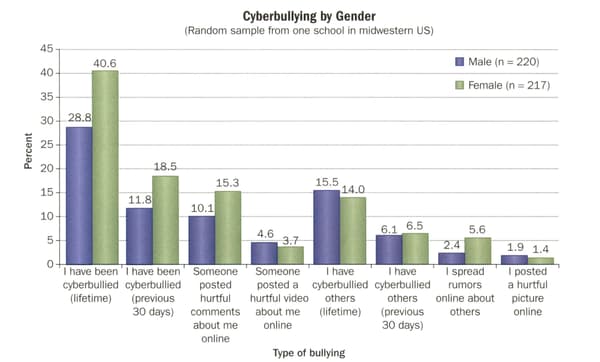
Why would a pie chart not be an effective way to represent this data?
Important Questions on Data Management Trends in Communities
Data was gathered on cyberbullying in a school.
Based on the graph, does cyberbullying seem to be a problem in this school? Justify your answer.
Year students in a school were asked for their grade in a science class, and about the use of their cell phone in the class.
| Frequency of cell phone use per class | Average grade in class |
Draw two different types of graph to represent the data. Discuss the effectiveness of each graph
Year students in a school were asked for their grade in a science class, and about the use of their cell phone in the class.
| Frequency of cell phone use per class | Average grade in class |
What trends do you see in data? Justify your answer.
Year students in a school were asked for their grade in a science class, and about the use of their cell phone in the class.
| Frequency of cell phone use per class | Average grade in class |
Propose an explanation for the trends you see in the data.
The data below represent the participation rate in various sports based on the family's income level.
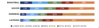
Which representation do you think is more effective, the original bar graph or the pie charts? Explain
The data below represent the participation rate in various sports based on the family's income level.

What characteristic about families do you see in this data ? Justify your answer.
The data below represent the participation rate in various sports based on the family's income level.

Based on the graph , which sport do you think is the most expensive to play? Explain
The data below represent the participation rate in various sports based on the family's income level.

How can a community increase participation in sports by families that don't necessarily have the means to afford it?


