
Draw a double bar graph to compare the data in the given table:
Enrolment in computer courses
Year/Course
Basic
Logo
Computer Science
Using Software
Year One
Year Two
Important Questions on Data Handling
The data given below shows the average rainfall in Udaipur from June to November of a certain year. Draw a bar graph to represent this information.
| Month | June | July | August | September | October | November |
| Average rainfall |
The table given below shows the population of four towns over two years.
| Towns | A | B | C | D |
(i) Draw a bar graph using appropriate scale to depict the information given here.
(ii) In which town was the population growth maximum.
(iii) In which town was the population growth least.
Numbers of children in six different classes are given below. Represent the data on a bar graph.
| Class | Fifth | Sixth | Seventh | Eighth | Ninth | Tenth |
|---|---|---|---|---|---|---|
| Number of Children |
How would you choose a scale?
The following table shows the market position of different brands of soaps. Draw a bar graph to represent this data.
| Brand | A | B | C | D | Others |
| Percentage of buyers |
Given below is a table which shows the year wise strength of the school. Represent this data by a bar graph
| Year | |||||
| Number of students |
Gold prices on Consecutive Tuesdays were as under. Draw a bar graph to show this information.
| Week | First | Second | Third | Fourth |
| Rate per |
The following data shows India's total population (in millions) from to . Represent the given data by a bar graph.
| Year | ||||||
| Population (in millions) |
The performance of a student in Term and Term is given. Draw a double bar graph choosing appropriate scale and answer the following:
| Subjects | English | Hindi | Math | Science | Social science |
|---|---|---|---|---|---|
| term (max marks ) | |||||
| term (max marks ) |
In which subject has the child improved his performance the most?
The following table shows the number of scooters produced by a company during six consecutive years. Draw a bar graph to represent this data.
| Year | ||||||
| Number of scooters |
The graph that is drawn to compare two quantities having the same units is:
The air distances of four cities from Delhi (in km) are given below. Represent the data by a bar graph.
| City | Kolkata | Mumbai | Chennai | Hyderabad |
| Distance from Delhi (in km) |
The following table shows the imports (in thousand crore rupees) made by India over the last five years. Draw a bar graph to represent this data.
| Year | |||||
| Imports (in a thousand crore rupees) |
In a survey or families of a colony, the number of members in each family was recorded, and the data has been represented by the following bar graph.
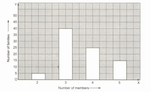
What information does the bar graph give?
The following table shows the interest paid by India (in a thousand crore rupees) on external debts during the period to . Represent the data by a bar graph.
| Year | ||||
| Interest (in thousand crore rupees) |
Use the bar graph to answer the following question.
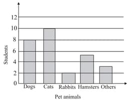
Which is the most popular pet?
Various modes of transport used by students of a school are given below. Draw a bar graph to show this information
| School bus | Private bus | Bicycle | Rickshaw | By foot |
Consider this data collected from a survey of a colony.
| Favourite Sports | Cricket | Basketball | Swimming | Hockey | Athletics |
|---|---|---|---|---|---|
| Watching | |||||
| Participating |
Draw a double bar graph choosing an appropriate scale. What do you infer from the bar graph?
From the data given below showing the minimum and the maximum temperature of various cities, plot a double bar graph and answer the following:
| Cities | Ahmedabad | Amritsar | Bangalore | Chennai | Delhi | Jaipur | Jammu | Mumbai |
|---|---|---|---|---|---|---|---|---|
| Max Temp(°C) | ||||||||
| Min Temp(°C) |
Which city has the largest difference in the minimum and maximum temperature on the given date?
In a public library, the librarian made the following observations in a particular week.
| Days | Monday | Tuesday | Wednesday | Thursday | Friday | Saturday |
| Newspaper reader | ||||||
| Magazine reader |
(i) Draw a double bar graph choosing an appropriate scale.
(ii) On which day, the number of readers in the library was maximum?
(iii) What is the mean number of magazine readers per day.
The birth rate per thousand in five countries over a period of time is as shown in the table. Represent the given data by a bar graph.
| Country | China | India | Germany | UK | Sweden |
| Birth rate per thousand |


