
Following questions are based on the triangular diagram and bar diagram given below. Study them carefully to answer these questions.
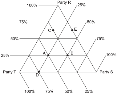
The above triangle diagram shows the distribution of votes amongthree parties R, S and T in five different constituencies in an election.The following diagram shows the total votes cast for the threeparties in these five constituencies.
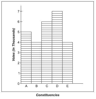
The constituency which casts more votes for S than for T is:
The above triangle diagram shows the distribution of votes amongthree parties R, S and T in five different constituencies in an election.The following diagram shows the total votes cast for the threeparties in these five constituencies.
The constituency which casts more votes for S than for T is:
Important Questions on Graphical Representation of Data
Study the given pie chart and answer the question that follows.
Total number of students admitted in a college
Distribution of the percentage of students in various courses.
 .
.
Percentage-wise distribution of the number of boys.
| Course | Number of boys |
| B.sc Math | |
| B.sc Physics | |
| B.sc Computer Science | |
| B.com | |
| B.sc Chemistry | |
| BBA |
The difference between the number of boys and the number of girls admitted in B.Com. is:
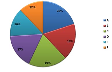
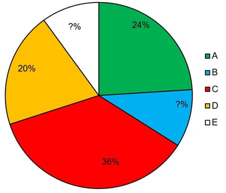
Study the given pie chart and table and answer the question that follows.
The pie chart represents the percentage wise distribution of students of class is a school in six different sections A, B, C, D, E, and F.
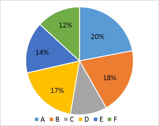 .
.
The table shows the number of boys of class X in six different sections A, B, C, D, E, and F.
| Section | A | B | C | D | E | F |
| No. of boys |
If the total number of students in section C is , then the total number of girls in section C and D together will be:
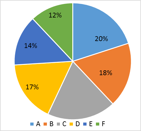
The following pie chart represents the percentage-wise distribution of students of class X in a school in six different sections A, B, C, D, E and F.

The given table shows the number of boys of class X in six different sections A, B, C, D, E and E.
| Section | A | B | C | D | E | F |
| No. of boys | ___ |
The total number of boys in sections A, B and D together is what pecentage more than the total number of girls in section A, B and D together?
The following Pie chart represents the percentage- wise distribution of students of class XII in a school in six different sections A, B, C, D, E and F.
The table given below shows the number of girls of class XII in six different sections A, B, C, D, E and F.
| Section | A | B | C | D | E | F |
| Number of girls |
The total number of girls in sections B, C and D together is what percentage more than the total number of boys in sections A, B and D together?
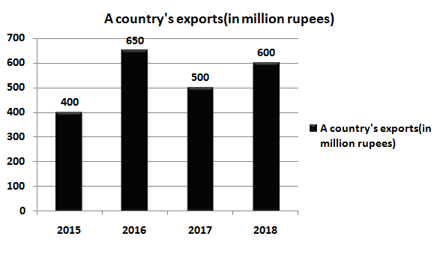
The given bar graph presents a country's exports (in million rupees) during , and the table that follows shows the break-up of goods exported in a year.

Break-Up of Goods Exported in a year
| Computers | |
| Garments | |
| Textiles | |
| Cosmetics | |
| Jewellery |
Total exports of cosmetics in four years is approx. what percent less than the total exports of Garments and Jewellery in and ?
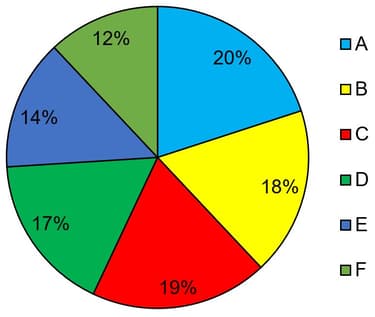
The given pie chart represents the percentage-wise distribution of students of class X in a school in six different sections A, B, C, D, E and F.
 .
.
The given table shows the number of boys of class X in six different sections A, B, C, D, E and F.
| Sections | A | B | C | D | E | F |
| No. of boys |
If in section E, the ratio of boys and girls is , then the ratio of the number of girls in section B to that of the number of girls in section E is:
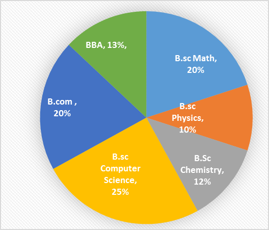
Study the given pie chart and answer the question that follows.
Total number of students admitted in a college
Distribution of the percentage of students in various couses.
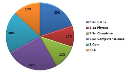
Percentage-wise distribution of the number of boys.
| Course | Number of boys |
| B.Sc. Maths | |
| B.Sc. Physics | |
| B.Sc. Chemistry | |
| B.Sc. Computer science | |
| B.Com | |
| BBA |
The ratio of the total number of girls admitted in B.Sc maths to the total number of students admitted in B.Sc maths is_____.
The given bar graph presents a country's exports (in million rupees) during , and the table that follows shows the break-up of goods exported in a year.

Break-Up of Goods Exported in a year
| Computers | |
| Garments | |
| Textiles | |
| Cosmetics | |
| Jewellery |
Total exports of Jewellery in and is what percent of the total exports of textiles in and ?
The following Pie chart represents the percentage-wise distribution of students of class in a school in six different sections and .
The table given below shows the number of boys of class in six different sections and .
| Section | ||||||
| Number of boys |
If in section , the ratio of the number of boys to the number of girls is , then find the ratio of the number of boys in section to the number of girls in section .
The following pie-chart and table show the percentage distribution of farmers in 5 states A, B, C, D & E of a country who claimed insurance due to drought in the year 2017 and ratio of males to females of the number of farmers in states, respectively.
Study the pie-chart and the table carefully and answer the following questions.
| State | Male : Female |
| A | 5 : 3 |
| B | 4 : 1 |
| C | - : - |
| D | 5 : - |
| E | 3 : 2 |
Note: Some data are missing in the pie-chart and table, if required in any question, find the missing data first and then answer the question Total number of farmers who claimed insurance in the year 2017 = 2,64,000
The number of farmers who claimed insurance in state C exceeds the total number of farmers (who claimed insurance) in state E and state A together by 5280. What is the percentage of farmers who claimed insurance in state E?
The given bar graph presents a country's exports (in million rupees) during , and the table that follows shows the break-up of goods exported in a year.
Break-Up of Goods Exported in a year
| Computers | |
| Garments | |
| Textiles | |
| Cosmetics | |
| Jewellery |
What is the ratio of the total exports of Computers in and to the total exports of Cosmetics in and ?
The line graph shows electricity consumption (in ) for three households A, B and C for months February to May.
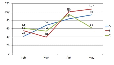
If the per- rate chart is:
| Rate per (₹) | |
| First | |
| Next | |
| Above |
In the given line graph, the electric charges collected from all (A, B and C) for the month of February is:
Study the following information and answer the questions that follow:
The pie chart below shows the percentage distribution of the monthly budget of a family.
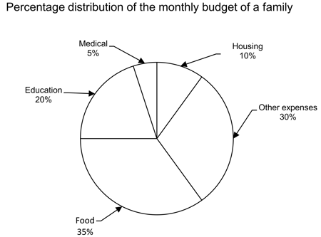
The line graph shows the monthly expenditure (in thousands) of a family to fulfil this budget from January to June.

What is the difference between the money they spent on education in the month of March and the money they spend on housing in April?
Study the following information and answer the given question based on the following data:
The below graphs shows the information about the increase/decrease in income and expenditure of Company and Company over the given period of time.
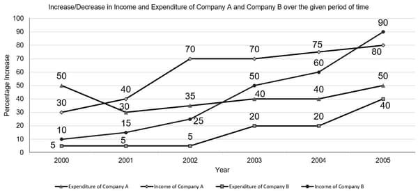
The below table shows information about the income and expenditure of Company and Company in .
| Company | Company | |
| Income in | ||
| Expenditure in |
What is the total income of Company in from ?
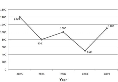
The following bar graph shows the percentage of boys and girls appeared for Class exam for the period of five years . The line graph shows the total number of students appeared and the table shows the total students passed and percentage of boys and girls passed in the exam.
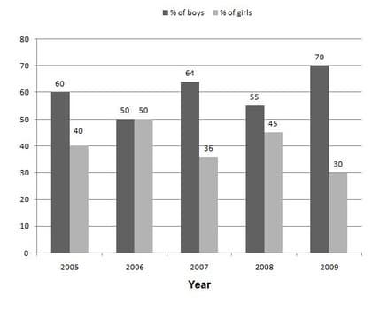
The table is as follows:
| Year | Total passed students | % of boys | % of girls |
What is the number of girls who failed in the year
Following bar graph shows the percentage of total number of students admitted in different streams in a college during the period of . The table shows the total number of admitted students during this period.
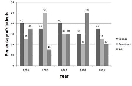
| Year | Total number of students admitted |
What is the average number of students admitted in Commerce stream?
The given pie chart shows the distribution of total IT professionals working in U.S. from different countries and the bar graph shows the percentage of male IT professionals. The total number of IT professionals working in U.S. is
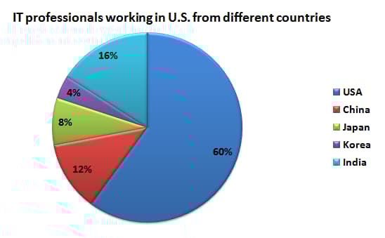
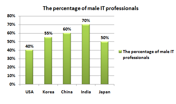
What is the total number of female employees working in USA as IT professionals?
Following bar graph shows the percentage of total number of students admitted in different streams in a college during the period of . The table shows the total number of admitted students during this period.

| Year | Total number of students admitted |
What is the ratio between number of years in which Science students admitted is more than Commerce students and the number of years in which Arts students admitted is more than Commerce students admitted?
Following bar graph shows the percentage of total number of students admitted in different streams in a college during the period of . The table shows the total number of admitted students during this period.

| Year | Total number of students admitted |
The number of students admitted in Arts stream in year is how much per cent more than that of total number of students admitted in Commerce in year


