
Fulmars form pairs for life unless one dies in which case the survivors takes a new partner. They breed on Rocky cliffs, returning each year to the same nest site. Males and females mate frequently with their partner during the first part of the breeding season after which the female develops and then lays one fertilised egg. The parents take turn (of up to 11 days) at incubating the egg. The male takes longer turn allowing the female to feed more and replace resources used to make the yolk of the eggs. The table gives data for the northern fulmar. The hatchling is fed on the nest by both parents until it has grown to 115 to 119 percent of adult mass. The parents then stop feeding it. Four or five days later It flies from the nest and become independent (fledging).
Breeding season
Late spring-early summer
Number of eggs
One per breeding season
Time to hatching
47-53 days after egg laying
Time of fledging
49-58 days from hatching
Average age of sexual maturity
12 years in females, 8 years in male
Average lifespan
32 years
Maximum lifespan
Over 50 years
Global population
7 million
Compare reproduction in fulmars and humans, giving as many similarities and differences as you can.
Important Questions on Reproduction
Fertility rate is the average number of young produced by a female during her life. On Orkney (Scotland) a long-running research program found that female fulmars on average raised 11 chicks to fledging (leaving the nest) during their breeding life, so that is the fertility rate of Fulmarus glacialis.
Explain how the fertility rate of species could be measured.You could either describe how this would be done for fulmars, or choose any other species apart from humans. Include the observations that would have to be made and any calculations that are needed.
The human population has been rising rapidly and there are concerns that now it is so high that damage to natural ecosystem is unavoidable. Further, increases in human population are inevitable unless fertility rates fall. This has already happened in most developed countries. China introduced a compulsory one child policy in 1978 – 80 to reduce fertility rates. The policy has now ended. Taiwan never introduced such a policy. The graph shows total fertility rate (average number of children born to each woman during her whole life), in China and Taiwan from 1945 to 2015.

What are the similarities and differences between China and Taiwan in total fertility rate?
The human population has been rising rapidly and there are concerns that now it is so high that damage to natural ecosystem is unavoidable. Further, increases in human population are inevitable unless fertility rates fall. This has already happened in most developed countries. China introduced a compulsory one child policy in 1978 – 80 to reduce fertility rates. The policy has now ended. Taiwan never introduced such a policy. The graph shows total fertility rate (average number of children born to each woman during her whole life), in China and Taiwan from 1945 to 2015.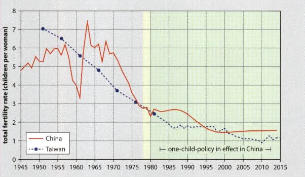
In 1960 a policy called the great Leap Forward caused a famine. Explain the effect that this had on the total fertility rate.
The human population has been rising rapidly and there are concerns that now it is so high that damage to natural ecosystem is unavoidable. Further, increases in human population are inevitable unless fertility rates fall. This has already happened in most developed countries. China introduced a compulsory one child policy in 1978 – 80 to reduce fertility rates. The policy has now ended. Taiwan never introduced such a policy. The graph shows total fertility rate (average number of children born to each woman during her whole life), in China and Taiwan from 1945 to 2015.
Prosperity rose in China increasingly rapidly from 1980 onwards. Some people claim that total fertility rate drops as prosperity rises, so women in China would have had fewer children even without a compulsory one child policy. Use the data in the graph to discuss this claim.
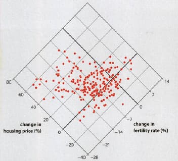
Scientists can influence what conclusions people draw from data by the format that they use to display it. Each point on the following graph shows the change in fertility rate and the cost of housing in one county in the US between 2010 and 2016.

What change happened to fertility in most counties between 2010 and 2016.
Scientists can influence what conclusions people draw from data by the format that they use to display it. Each point on the following graph shows the change in fertility rate and the cost of housing in one county in the US between 2010 and 2016.

What line of best fit on the graph would show the trend in the data?
Scientists can influence what conclusions people draw from data by the format that they use to display it. Each point on the following graph shows the change in fertility rate and the cost of housing in one county in the US between 2010 and 2016.

What conclusion do you draw from this graph?
Evolutionary biologist Carl Bergstrom and information scientists Jevin West have suggested a new way of presenting data - a diamond plot. The following graph shows the same data as the previous graph, but in a diamond plot.
What line of best fit on diamond plot would show trend in the data?


