Study the following graph carefully and answer the questions given below it:
What was the price difference between commodity A and B in the month of May?
Important Questions on Graphical Representation of Data
The line graph shows the monthly expenditure by two families in :
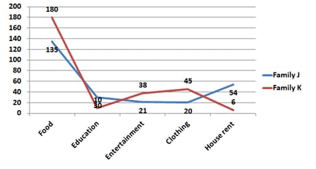
In the given line graph, what is the ratio of the difference in spending between food and education for family J and K?
The line graph shows the monthly expenditure by two families in :

In the given line graph, if the monthly income of Family K increases to . What will be the increase in expenditure on entertainment? (Assuming they spend the same proportion as before, round off to one decimal)
The line graph shows electricity consumption (in ) for three households A, B and C for months February to May.
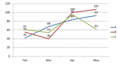
In the given line graph, the difference between the total electrical consumption between months of February and April is:
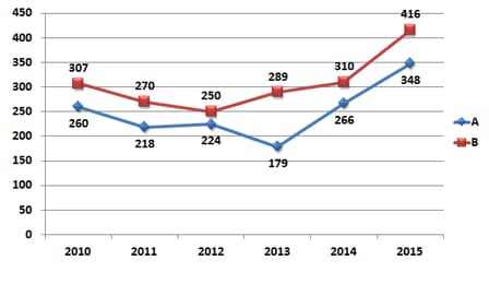
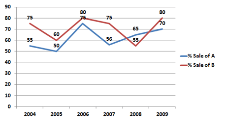
The line graph shows the production of product A and B (in ) during the period to and the second line graph shows the percentage sale of these products.
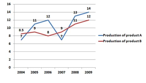

In the given line graph, what is the total sale of product A in the year and taken together?
The line graph shows the temperature on four Sundays of three cities

In the given line graph. What was the average temperature on the Sunday in all the three cities? (rounded to first decimal)
The line graph shows the temperature on four Sundays in three cities,

In the given line graph, when was the maximum temperature recorded in Delhi?
The line graph shows electricity consumption (in ) for three households A, B and C for months February to May.

In the given line graph, the percentage increase in electricity consumption of 'B' between March and May is:
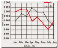
Two different finance companies declare a fixed annual rate of interest on the amount invested by investors with them. The interest rate declared by these companies can vary from year to year depending on the variation in the country's economy and the interest rate of the banks. The annual rate of interest offered by the two companies P and Q are shown in the graph below. Study the graph and answer the question. Annual percentage rate of interest offered by two finance companies P and Q over the years.
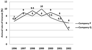
A sum of was invested in company Q in the year for . How much more simple interest will accrue if the amount was invested in company P?
The line graph shows the temperature on four Sundays in three cities.
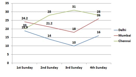
In the given line graph, when was the maximum temperature recorded in Chennai?
The line graph shows the temperature on four Sundays of three cities
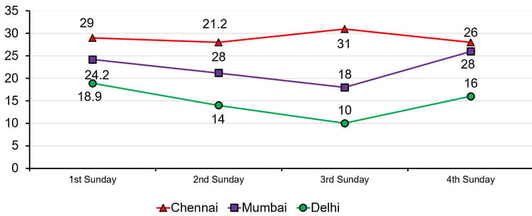
In the given line graph, what was the difference in temperature between Delhi and Chennai on the Sunday?
The line graph shows the temperature on four Sundays of three cities.
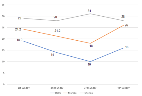
In the given line graph, what was the average temperature on the Sunday in all the three cities? (rounded to first decimal)
The line graph shows the production of A and B (in thousands) during the period to and the second line graph shows the percentage sale of these products.

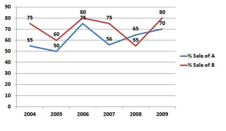
In the given line graph, what is the total sale of products A and B in the year
Two different finance companies declare a fixed annual rate of interest on the amount invested by investors with them. The interest rate declared by these companies can vary from year to year depending on the variation in the country's economy and the interest rate of the banks. The annual rate of interest offered by the two companies P and Q are shown in the graph below. Study the graph and answer the question. Annual percentage rate of interest offered by two finance companies P and Q over the years.
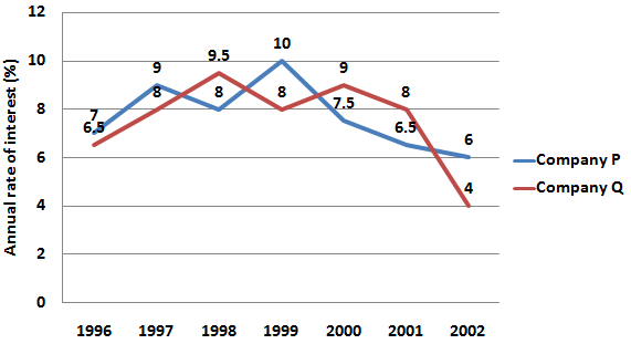
If two sums in the ratio are invested in companies P and Q respectively in , then what is the ratio of the simple interests received from companies P and Q respectively after ?
The line graph shows the temperature on four Sundays in three cities,
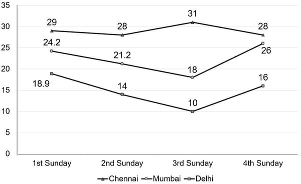
In the given line graph, what was the difference in temperature between Delhi and Mumbai on the Sunday?
Two different finance companies declare a fixed annual rate of interest on the amount invested by investors with them. The interest rate declared by these companies can vary from year to year depending on the variation in the country's economy and the interest rate of the banks. The annual rate of interest offered by the two companies P and Q are shown in the graph below. Study the graph and answer the question:
Annual percentage rate of interest offered by two finance companies P and Q over the years.
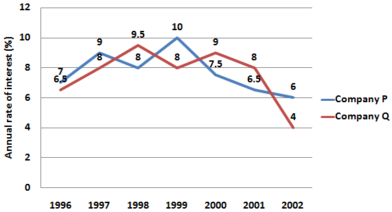
An investor invested a sum of in the company in the year 2000. After , the entire amount was transferred to company P in as an investment for . What amount will the investor receive from company P?
Study the line graph and answer the question that follows.
The line graph represents the number of vehicles (in ) manufactured by two automobile companies A and B over the years from .
The x-axis represents the years and the y-axis represent the number of vehicles (in ).
The data shown here is only for mathematical excise. They do not represent actual figure of the country.
The average value of the vehicles manufactured by company A is what percent of the average value of the vehicles manufactured by company B during ?
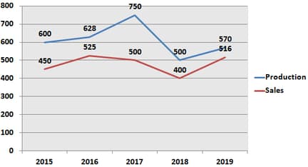
The line graph shows the production (in tonnes) and the sales (in tonnes) of a company.
What is the ratio of the production of the company in taken together to the sales in taken together?
The line graph shows the monthly expenditure by two families in hundreds:

In the given line graph, what is the difference in percentage of spending on food between family J and K?
The line graph shows the production of A and B (in thousands) during the period to and the second line graph shows the percentage sale of these products.
In the given line graph, what is the total sale of Product B in the year and together?
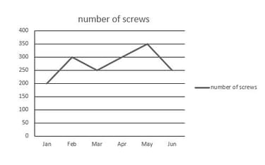
According to the chart below, in which month less than screws were manufactured?