
The following table gives the quantity of petrol and its cost.
Quantity of petrol (in litres)
10
15
20
25
Cost of petrol (in ₹)
500
750
1000
1250
The graph given below is showing the above data.
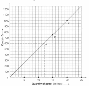
At the cost of , how much petrol do you get?
Important Questions on Introduction to Graphs
The expenditure of a municipal corporation of a city in different sectors is given below:
| Sector | Expenditure (in Lakh) |
| Education | |
| Health services | |
| Beautification | |
| Surface transport | |
| Others |
Draw a pie-chart to represent the above data.
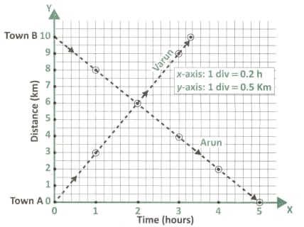
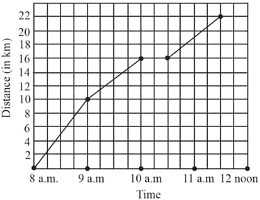
Varun starts from Town and walks towards Town . Arun starts from Town at the same time and walks towards Town . The graph given in the figure represents this information. From the graph, find
the average speed of Varun.
The following table shows the number of motorcycles produced by a company during six consecutive years.
| 2009 | 2010 | 2011 | 2012 | 2013 | 2014 |
| 14000 | 16000 | 18500 | 21000 | 24000 | 30000 |
Draw a bar graph to represent the above data.
Draw the graph for the following table of costs of Apples, with suitable scale on the axes.
| Number of apples | |||||
|---|---|---|---|---|---|
| Cost (in ₹) |
The following table shows the export earnings of India (in thousand crore rupees) during five consecutive years.
| year | 2010-11 | 2011-12 | 2012-13 | 2013-14 | 2014-15 |
|
export(in thousand crore rupees) |
540 | 600 | 750 | 950 | 1100 |
Represent the above data by a bar graph.
Use the table below to draw a linear graph for the number of days a hillside city received snow in different years:
| Years | ||||
|---|---|---|---|---|
| Days |
Study the double bar graph given below and answer the questions that follow.
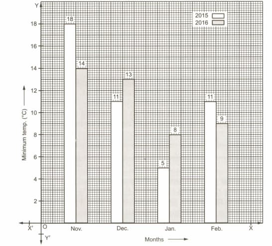
What is the ratio of minimum temperatures in the year to the year in the month of November?
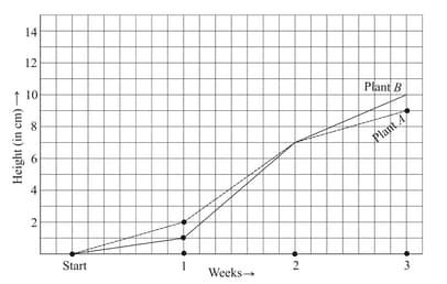
For an experiment in Botany, two different plants, plant and plant were grown under similar laboratory conditions. Their heights were measured at the end of each week for weeks. The results are shown by the following graph.
Were the two plants of the same height during any week shown here? Specify.
The following data shows India’s total population (in millions) from 1961 to 2011.
| Year | 1961 | 1971 | 1981 | 1991 | 2001 | 2011 |
| population(in millions) | 360 | 420 | 540 | 680 | 1020 | 1200 |
Represent the above data by a bar graph.
In a survey of families of a village, the number of members in each family was recorded, as shown by the bar graph given below:
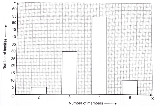
Read the bar graph carefully and answer the following questions.
(i) What does the bar graph show?
(ii) How many families have less than five members?
(iii) How many families have more than three members?
(iv) How many families have two children?
Or
(iv)How many families have two members?
The present population (in lakhs) of six Indian states is given below:
| State | Population(in lakhs) |
| Bihar | 1040 |
| Chhattisgarh | 260 |
| Jharkhand | 330 |
| Madhya Pradesh | 720 |
| West Bengal | 910 |
| Rajasthan | 690 |
Represent the above data by a bar graph.
Can there be a time-temperature graph as follows? Justify your answer.
There are 1120 creatures in zoo as per list given below :
| beast animals | other land animals | water animals | birds | reptiles |
| 220 | 410 | 165 | 190 | 135 |
Represent the above data by a bar graph.
Varun starts from Town A and walks towards Town B. Arun starts from Town B at the same time and walks towards Town A. The graph given in the figure represents this information. From the graph, find
when and where Varun and Arun meet.

Look at the bar graph given below:
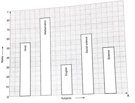
Read the above bar graph carefully and answer the questions given below.
(i) What does the bar graph show?
(ii) In which subject is the student very poor?
(iii) If maximum marks in each subject be 100, what is the average of his marks?
(iv) On the basis of marks obtained, find the subject in which the student has special interest.
A courier-person cycles from a town to a neighbouring suburban area to deliver a parcel to a merchant. His distance from the town at different times is shown by the following graph. Did the person stop on his way? Explain.
Study the following graph carefully and answer the given question. Number of students (Males & Females) passed out from various colleges in a year. (Number in thousands) is shown below:
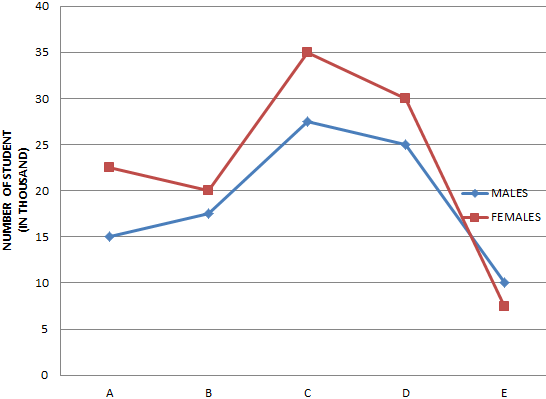
COLLEGES
What is the average number of students (Males & Females) passed out from all the colleges together?
The following graph shows the temperature of a patient in a hospital, recorded every hour.
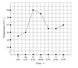
What was the temperature at p.m.? How did you arrive at your answer?


