
The following table shows the life expectancy (average age to which people live) in various countries in a particular year.
Country
India
Japan
Britain
Ethiopia
Cambodia
Life expectancy (in years)
65
80
75
50
45
Represent the above data by a bar graph.
Important Questions on Data Handling
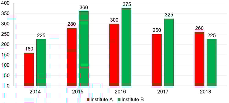
The bar graph shows the number of students enrolled for a vocational course in institutes and during from to .

The total number of students enrolled in institutes during and is what per cent of the total number of students enrolled in institute during the five years?
The given bar graph shows the imports and exports (in crore ) of steel for years from to .
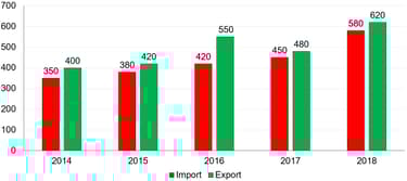
What is the ratio of average export to average import over the five years?
The bar graph shows the number of students enrolled for a science course in institutes and during from to ,
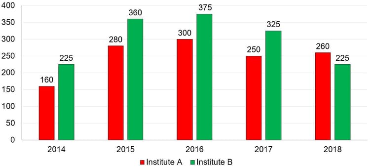
What is the ratio of the total numbers of students enrolled in institute in and to that of students enrolled in institute in and ?
Study the following graph and answer the question the follows.
The marks scored by five students and in three subjects (Maths, English and Physics). Total marks for each subject are .
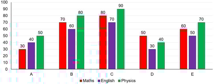
What is the percentage marks obtained by in all three subjects together? (Assuming maximum marks for each subject are .)
The bar graph shows the number of students enrolled for a vocational course in institutes and during from to .
In which year, the number of students enrolled in institute is less, where , than the number of students enrolled in institute in the same year?
Study of given bar graph and answer the question that follows.
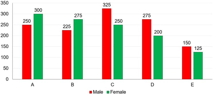
The given bar graph represents the Sales Turnover (in crore) of five automobile companies and during and . The X-axis represents the Companies, and the Y-axis shows the Sales Turnover (in crore).
(The data shown here is only for mathematical exercise. They do not represent the actual figure of the company.)
If there was an increase of in the average of the sales turnover of all the companies together in from that in , then what was the average (in crore, up two decimal places) of the sales turnover of all the companies together in ?
The following Bar Graph represents the Production of Fertilizers by Company and Company (in tonnes) Over the Years from to . The -axis represents the years, and the -axis represents the Production of Fertilizers (in tonnes).
Note: The data shown below is only for mathematical exercise. They do not represent the actual figures of companies
What is the average production (in tonnes) of fertilizers in and of Company ?
Medicines of three different flavours - and (in lakh bottles) manufactured by a pharmaceutical company over a period of five years from to is given in the bar graph.
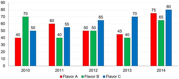
Production of flavor in is what per cent less than the average production of flavor in all the years (correct to two-decimal places)?
Study the given bar graph and answer the question.
The bar graph given below represents the data of the Production of Paper (in ten lakh tonnes) by three different companies and during the years to . The -axis shows the Years and the -axis represents the Production of Paper (in ten lakh tonnes).
(Note: The data shown below is only for mathematical exercise. They do not represent the actual figures.)
Which company/companies had the maximum average production for the given five years period?
Directions: The number of male and female members in different organisations and are given in the bar graph.
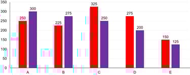
What is the ratio of the average number of females in all five organisations to the average number of males in all five organisations?
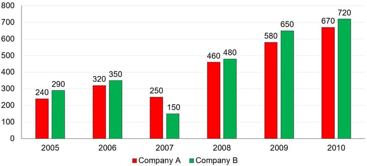
The following Bar Graphs represent the Export of Tea (in lakh tonnes) by two companies and during the years to .
Study the chart and answer the question written below:
(Note: The data shown below is only for mathematical exercise. They do not represent the actual figures).
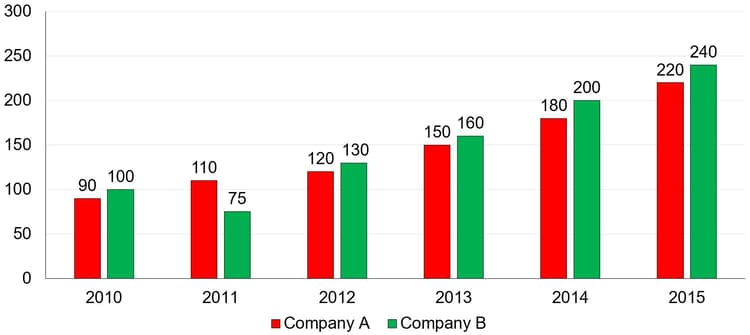
What is the ratio of the total exports of company in and to the total exports of company in and ?
A survey was conducted in a class to find the preference of students for the soft drinks and recorded as follows:
| Soft drinks | Number of students |
|
Orange juice Cola Lime juice Mango juice Melon Juice |
Make a bar graph with a suitable scale for the above data.
The bar graph shows the number of students enrolled for a vocational course in institutes and during years.

The average number of students enrolled in institute during and is what per cent less than the number of students enrolled in institute during (correct to two decimal places)?
The following bar graph shows the demand and production (in lakhs) of motorcycles of five different companies and in .
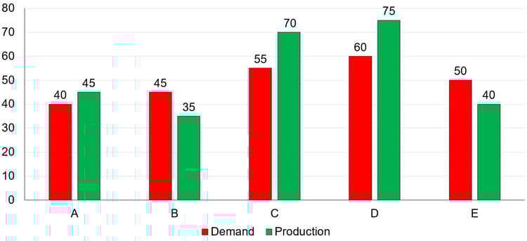
What is the ratio of the total production of motorcycles of companies and , to that of the total demand of motorcycles of all the companies during the five years?
The bar graph shows the number of males and females in five organizations and .
For which organisation, difference between the number of males and the average number of females of all the organisations is minimum?
The bar graph below shows the sales of Newspapers (in lakh number) from six branches of a Media Publication Company during two consecutive years and .
(Note: The data shown below is only for mathematical exercise. They do not represent the actual figures).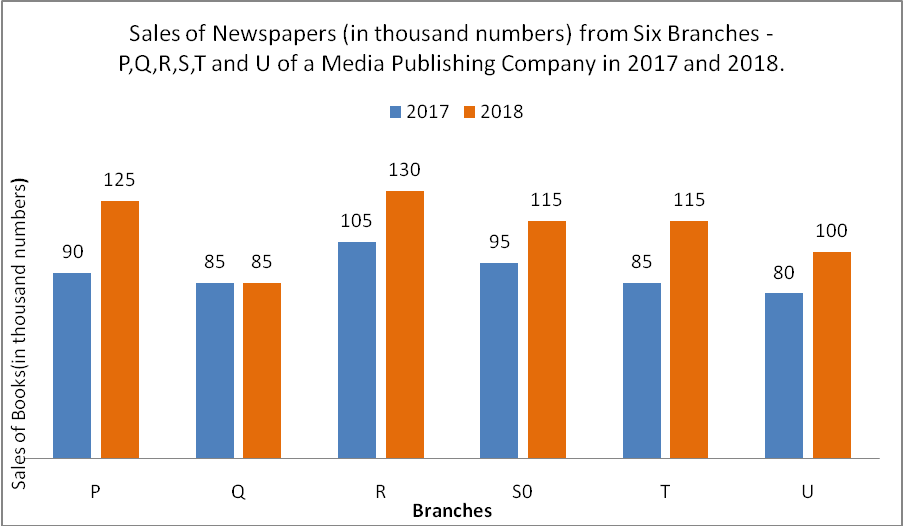
Total Sales of U for both the years is what percent (correct to one place of decimal) of the combined Sales of the branches Q and R for and ?
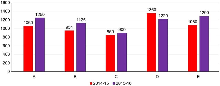
Bar graph shows the number of males and females in five organizations A,B,C,D and E:
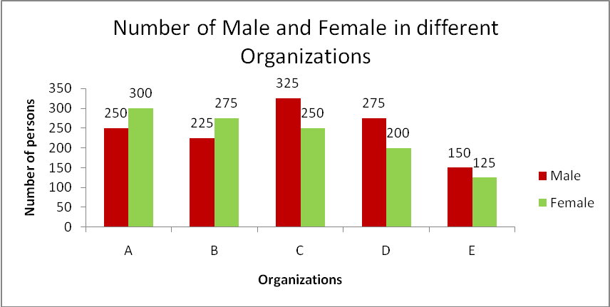
What is the ratio of number of males working in organizations C,D and E taken together to that of females working in organizations A,B and C taken together?
Cough syrup of three different flavours - and (in lakh bottles) manufactured by a medicine company over a period of five years from to has been shown in the bar graph.
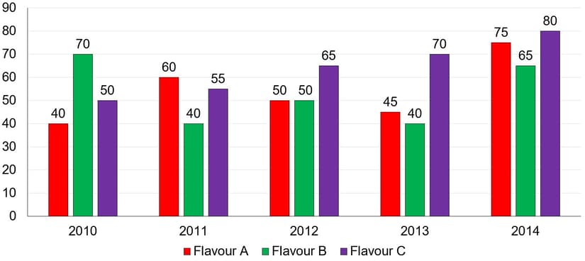
The ratio of the average production of all flavours in to the difference of the average production of flavour in and and the average production of flavour in and is:
The table below shows, children of a class sorted according to their marks in an examination.
| Marks | Number of children |
If we arrange the children from the one with the least mark to the one with the greatest, then what will be the assumed mark of the student?
Directions: The Bar graph given below presents the marks (out of ) obtained by students in a subject.

What is the average of the marks obtained by all the students?


