
The line graph shows the temperature of a patient in a hospital, recorded every hour.
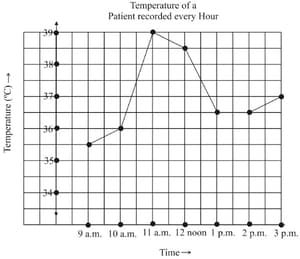
What was the patient’s temperature at ?
Important Questions on Graphical Representation of Data
The line graph shows the temperature of a patient in a hospital, recorded every hour.

When was the patient’s temperature .
The line graph shows the temperature of a patient in a hospital, recorded every hour.

The patient’s temperature was the same two times during the period given. What were these two times?
The line graph shows the temperature of a patient in a hospital, recorded every hour.
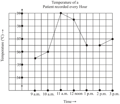
What was the temperature at ? How did you arrive at your answer?
The line graph shows the temperature of a patient in a hospital, recorded every hour.

During which periods did the patients, temperatures show an upward trend?
Draw the temperature-time line graph for the following data.
| Time (in hours) | ||||||
|---|---|---|---|---|---|---|
| Temperature (in ) |
The number of students in a hostel speaking different languages is given below. Represent the data in a pie chart.
| Languages | Hindi | English | Marathi | Tamil | Bengali | Total |
|---|---|---|---|---|---|---|
| Number of students |
The following data gives the amount spent on the construction of a house. Draw a pie chart.
| Item | Cement | Timber | Bricks | Labour | Steel | Misc. |
|---|---|---|---|---|---|---|
| Expenditure (in thousands) |
The expenditure of a firm under different heads in term of percentage expenditure is given below. Draw a pie chart.
| Items | Wages | Rent | Maintenance | Miscellaneous |
|---|---|---|---|---|
| Percentage |


