
The number of saplings planted by schools on World Tree Day is given in the graph below.
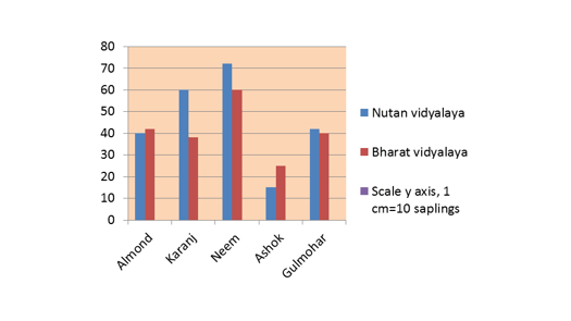
Which plant has the highest number of saplings planted in total?
Important Questions on Double Bar Graph
The given bar graph represents the number of boys and girls in five different schools. Study the graph and answer the question that follows.

What is the average number of boys in schools A, B, C, D and E?
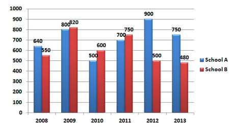
The given bar graph shows the number of students of two schools over a period of six years.
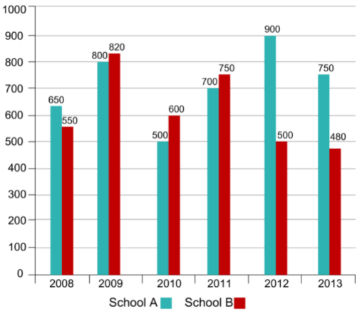
In the bar graph, what is the ratio of students taken for the years together from school A to the students taken for the years together from school B?
The given bar graph represents the number of boys and girls in five different schools. Study the graph and answer the question that follows.
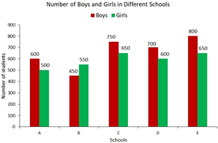
In which school is the percentage of girls the lowest?
The given bar graph represents the number of boys and girls in five different schools. Study the graph and answer the question that follows.
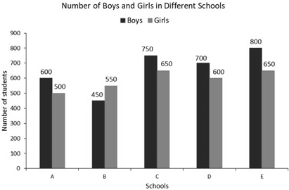
What is the ratio of girls and boys from all the schools taken together?
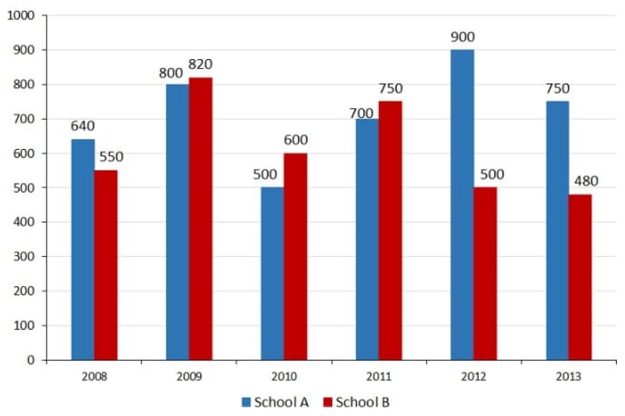
The given bar graph shows the number of students of two schools over a period of six years.
In the bar graph, what is the ratio of the average of the total students from school A to the average of the total students from school B?
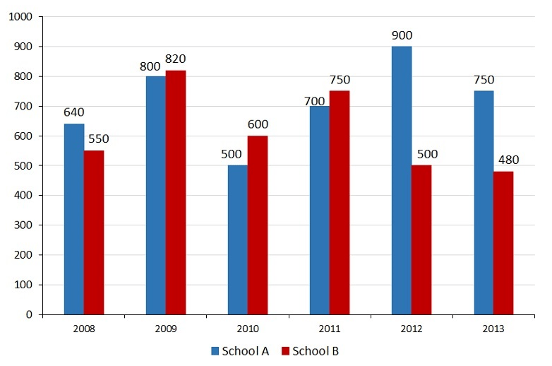
The given graph shows the number of students of two schools over a period of six years.
In the bar graph, in which year is the sum of the students from schools A and B taken together, the minimum?
The given bar graph shows the number of students of two schools over a period of six years.
In the bar graph, what is the ratio of students taken for the years together from school A to the students taken for the years together from school B?
Study the graph and answer the question.
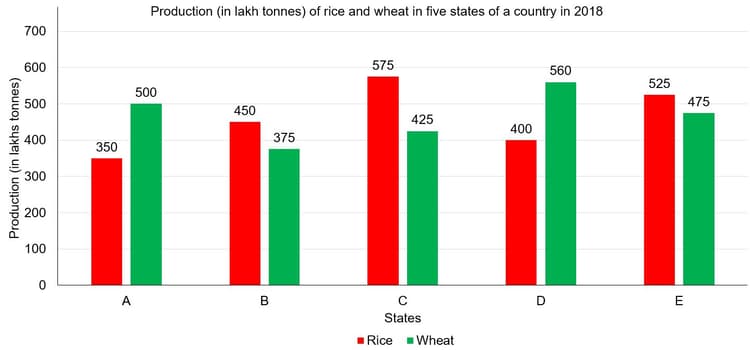
Total production of wheat in states , and is what percentage less than the total production of the rice in states , and ?
The following graph shows the net profit percent of two companies-
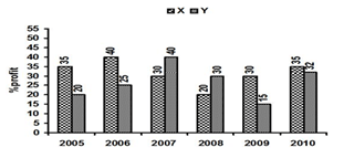
In how many of the given years the percentage of expenditure of company Y with respect to its income was greater than percent?
The given bar-graph shows the percentage expenditure of a person on food and education items for five years and the table given below shows the total expenditure of that person for these five years.

| Year | Expenditure |
Consider the following data gathered from a survey of a colony:
| Favorite Sport | Cricket | Basketball | Swimming | Hockey | Athletics |
| Watching | |||||
| Participating |
Draw a double bar graph choosing an appropriate scale. What do you infer from the bar graph?
Which sport is most popular?
Study the double bar graph given below and answer the questions that follow.
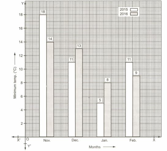
What is the ratio of minimum temperatures in the year to the year in the month of November?
From the data given below showing the minimum and the maximum temperature of various cities, plot a double bar graph and answer the following:
| Cities | Ahmedabad | Amritsar | Bangalore | Chennai | Delhi | Jaipur | Jammu | Mumbai |
|---|---|---|---|---|---|---|---|---|
| Max Temp(°C) | ||||||||
| Min Temp(°C) |
Which city has the largest difference in the minimum and maximum temperature on the given date?
The performance of students in 1st term and 2nd term is as given below. Draw a double bar graph choosing appropriate scale and answer the following:
In which subject, has the children improved their performance the most?
The bar chart representing the number of first-year B.Com. Students of St. Xavier's College using different companies' smartphones. Study bar chart and answer.
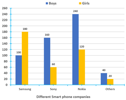
The bar chart representing the no. of students using different smart phones.
What percentage of girls are using the smartphones of Nokia?
| Students in a school band | ||
|---|---|---|
| Instrument | Class | Class |
| Flute | ||
| Tabla | ||
| Drums | ||
| Casio | ||
| Trumpet |
Study the following graph which shows the income and expenditure of a company over the years and answer questions.
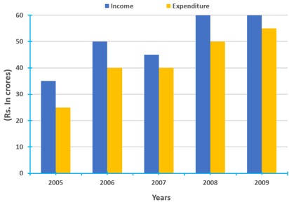
In how many years was the expenditure of the company more than the average expenditure of the given years?
The data given shows the registration of number of bikes and total vehicles (in thousands) for six months in in city .
Note : In chart, the first represent bikes and second represent the total number of vehicles.
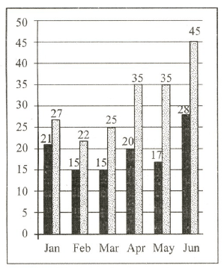
What is the total increase in registration of bikes from May to June ?
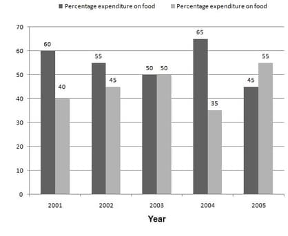
| Year | Expenditure |
In which year there was the highest increases over the preceding year in the amount of money spend on education?
The following Bar graph gives the number of products manufactured and sold by a company over the years (in thousands):
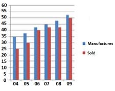
What is the respective ratio of the number of products not sold by the company in the year to those not sold in the year ?


