
The two graphs shown here represent the same data regarding child labour.
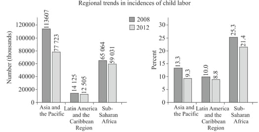
If you wanted to compare child labour in different regions of the world, which graph more fairly represents the data? Explain.
Important Questions on Data Management Trends in Communities
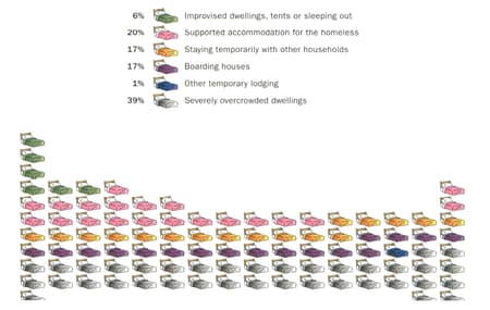
This infographic, compiled by Homelessness Australia, shows the dwelling situation for homeless people in Australia.

What kind of data (categorical, ordinal, discrete, or continuous) is being collected? Explain your reasoning.
This infographic, compiled by Homelessness Australia, shows the dwelling situation for homeless people in Australia.

Describe what this graph is displaying.
This infographic, compiled by Homelessness Australia, shows the dwelling situation for homeless people in Australia.

What aspects of this graph make it effective? What aspects make it less effective? Give reasons for your answers.
This infographic, compiled by Homelessness Australia, shows the dwelling situation for homeless people in Australia.
What type of graph do you think would be more effective at representing this data? Explain your choice. Draw the graph.
In a survey carried out in the US on youth risk behaviour, it was found that of the of high school students who rode bikes in the last year, of them rarely or never wore helmets.
What kind of data (categorical, ordinal, discrete, or continuous) was collected? Explain your reasoning.
In a survey carried out in the US on youth risk behaviour, it was found that of the of high school students who rode bikes in the last year, of them rarely or never wore helmets.
What aspects of this graph make it effective? What aspects make it less effective? Give reasons for your answers.
In a survey carried out in the US on youth risk behaviour, it was found that of the of high school students who rode bikes in the last year, of them rarely or never wore helmets.
What does this tell you about youth risk behavior?
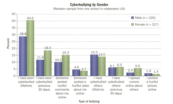
Data was gathered on cyberbullying in a school.
What characteristics do you see in this school? Explain.


