
Which form of graph would be appropriate to display the following data:
Production of food grain of a state.
Year
Production (in lakh tons)
Important Questions on Data Handling
Which form of graph would be appropriate to display the following data:
Choice of food for a group of people.
| Favourite food | Number of people |
| North Indian | |
| South Indian | |
| Chinese | |
| Others | |
| Total |
Which form of graph would be appropriate to display the following data:
| Daily Income | Number of workers |
| Total |
A survey was made to find the type of music that a certain group of young people liked in a city. Adjoining pie chart shows the findings of this survey.
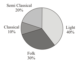
If people liked classical music, how many young people were surveyed?
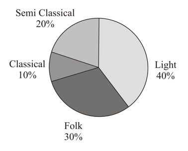
A survey was made to find the type of music that a certain group of young people liked in a city. Adjoining pie chart shows the findings of this survey. Which type of music is liked by the maximum number of people: Semi Classical / Folk / Light?
A survey was made to find the type of music that a certain group of young people liked in a city. The below pie chart shows the findings of this survey.
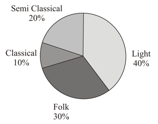
If a cassette company were to make CD’s, how many of each type would they make?
A group of people were asked to vote for their favourite season from the three seasons, rainy, winter and summer.

Which season got the most votes?
A group of people were asked to vote for their favourite season from the three seasons, rainy, winter and summer.
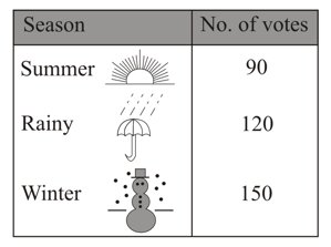
Find the central angle of each sector if you have to represent it in a pie chart?
A group of people were asked to vote for their favourite season from the three seasons, rainy, winter and summer.
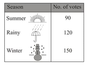
Draw a pie chart to show this information.


