
Which of the graphs is a bar graph and histogram.
Important Questions on Quantity
In a factory, there are workers who have been categorised into five groups () on the basis of the range of their daily wages (in multiples of ). The distribution is presented through a Histogram shown below:
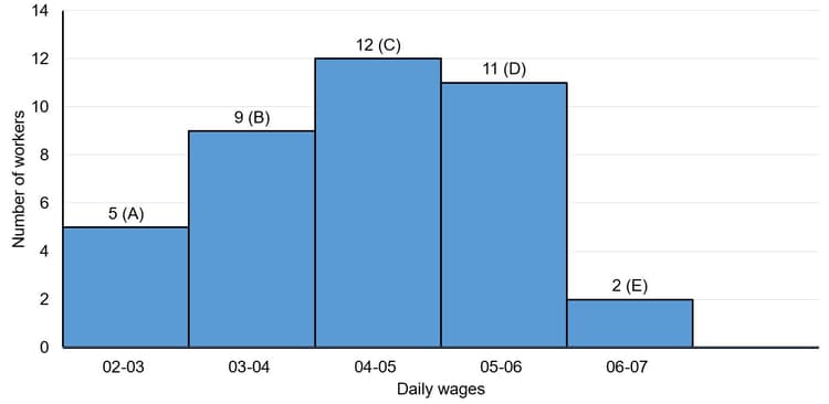
What is the ratio of the number of employees whose daily wages are or more but less than to that of the number of employees whose daily wages are or more but less than ?
Study the graph and answer the question,
The number of workers in the factory whose daily wages are or more but less than is:
The modal class of the frequency distribution given below is _____.
| Class | |||||
| Frequency |
The given graph shows the marks obtained by the students in an examination.
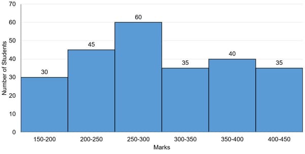
The numbers of students who obtained less than marks is what percent more than the number of students who obtained or more marks?
Population of city A, B and C from
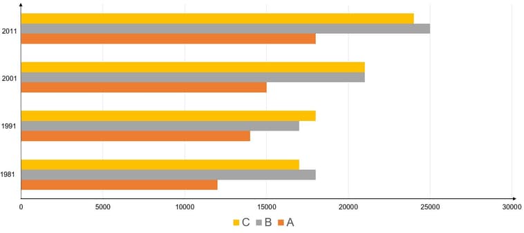
Choose the correct statement:
The given graph shows the weights of students in a school on a particular day.
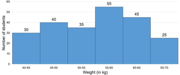
The number of students weighing less than is what percent less than the number of students weighing or more?
Study the following graph carefully and answer the given question. Preferences of students in a school is playing different games over the years.

In all the years, how many more people have preferred to play cricket than football?
The lower limit of the modal class of the following data is
| Class Limit (CL) | Frequency |
|---|---|
Study the graph carefully and answer the questions that follow:
Number of students passed (in thousands) from two universities over the years.

What is the total number of students who passed from university B in years together?
Study the graph carefully the answer the questions that follow:
Number of students passed (in thousands) from two universities over the years.

What is the ratio of the number of students passed from university in to the number of students passed from university in ?
The number of hours for which students of a particular class watched television during holidays is shown through the graph given below:
See the graph given and answer the following questions
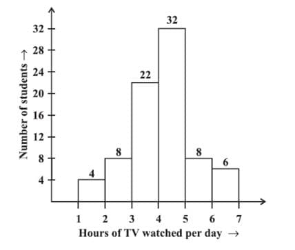
How many students spent less than in TV watching ?
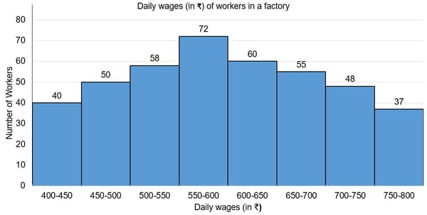
The table below has given quarterly statistics on the country's Food grain supply, in '000 tonnes, from the four geographic regions. When the supply from the four geographic regions is unable to meet the consumption demand, the go downs stocks are used to make good the shortfall.
(Figure in the table are in '000 tonnes.)
| MONTH | NORTH | SOUTH | EAST | WEST | GODOWNS | CONSUMPTION |
| Quarter 1 | ||||||
| April | 10 | 20 | 12 | 8 | 50 | 100 |
| May | 15 | 25 | 11 | 10 | 20 | 80 |
| June | 32 | 40 | 23 | 10 | 0 | 82 |
| Quarter 2 | ||||||
| July | 20 | 20 | 25 | 5 | 20 | 90 |
| August | 35 | 38 | 26 | 5 | 0 | 92 |
| Sept | 40 | 30 | 25 | 10 | 0 | 76 |
| Quarter 3 | ||||||
| Oct | 36 | 24 | 40 | 15 | 0 | 80 |
| Nov | 32 | 21 | 20 | 20 | 0 | 82 |
| Dec | 26 | 25 | 12 | 15 | 22 | 90 |
| Quarter 4 | ||||||
| Jan | 21 | 11 | 5 | 5 | 16 | 50 |
| Feb | 26 | 17 | 12 | 10 | 0 | 60 |
| March | 19 | 20 | 15 | 0 | 0 | 49 |
Which region supplied the greatest proportion of food grains consumed during the year?
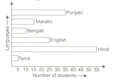
i. How many students are there in the hostel?
ii. What is the ratio of the number of students speaking Punjabi to those speaking English?
iii. What is the percentage of the students speaking Marathi over those speaking Hindi?
Study the following graph carefully and answer the given question.
Preferences of students in a school is playing different games over the years.
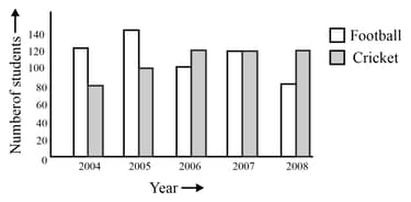
From which onwards did football start gaining more popularity?
Study the graph carefully the answer the questions that follow:
Number of students passed (in thousands) from two universities over the years.
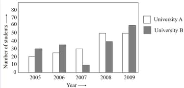
Number of students passed from university in the year is approximately what percentage of the total number of students passed from the university over the years?
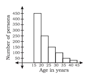
The ratio of the number of persons between the age group of and is :
Study the graph carefully and answer the question given below it.

The wheat import in was approximately how many times to that of the year ?
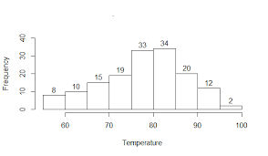
A random survey of the number of children of various age groups playing in park was found as follows:
| Age(in years) | Number of children |
Draw a histogram to represent the data above.
Study the graph carefully and answer the question given below it.
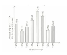
In which year did the wheat import register highest increase over its preceding year?


