
Constructing and Interpreting Bar Graphs
Important Questions on Constructing and Interpreting Bar Graphs
What is the upper limit of the class interval ?
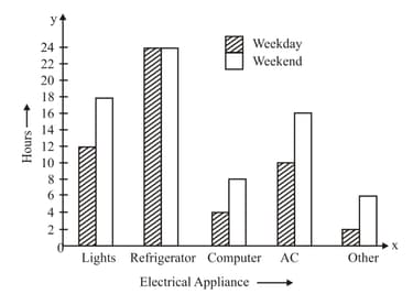
This double-column graph compares the average number of hours an electrical appliance is used on weekdays and weekends.
Read the graph and answer the following question
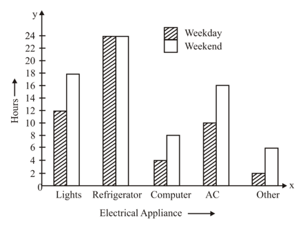
What is the average number of hours an AC is used on weekend?
This double-column graph compares the average number of hours an electrical appliance is used on weekdays and weekends.
Read the graph and answer the following question

Which appliance has got the maximum usage?
The following table shows the number of students in a school playing five different games
| Games | Football | Hockey | Cricket | Tennis | Squash |
| Number of students |
Present the information on a bar graph
In the frequency table
The class mark for the class interval is .
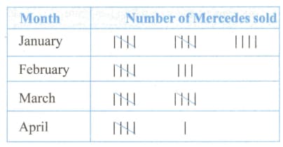
The bar chart represents the data given in the frequency table shown below. The bar for which month is incorrectly drawn?
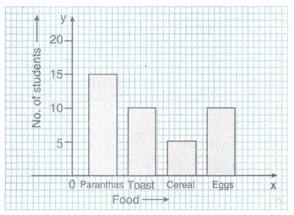
The bar graph shows the preferred breakfast food for students. The number of students who prefer paranthas as a percentage of the total number of students is
In the class interval, is not included.
The bars of a bar graph can be of different widths.
What is the mid value of a class interval called?
This double column graph compares the average number of hours an electrical appliance is used on weekdays and weekends.
Read the graph and answer the following questions.
Which appliances are each used for more hours on a day on weekends than on a weekday?
This double column graph compares the average number of hours an electrical appliance is used on weekdays and weekends.
Read the graph and answer the following questions.
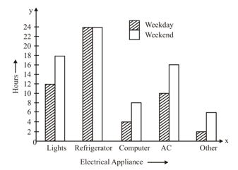
Which appliance is used twice as many hours on the weekend as it is used on weekdays?
Given a graph showing the areas (in thousand square miles) of the five Great Lakes.
Read the bar graph carefully and answer the question given below.
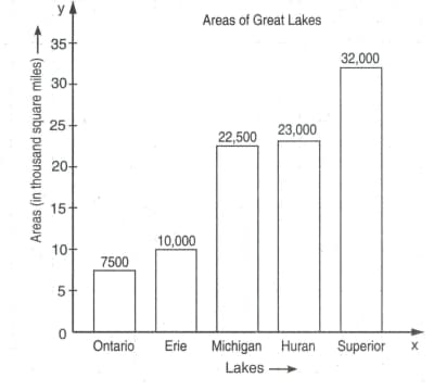
How many square miles of area is represented by block on the vertical axis?


