
David Weber, Talei Kunkel, Harriet Simand and, Justin Medved Solutions for Chapter: Data Management Trends in Communities, Exercise 29: Practice 6
David Weber Mathematics Solutions for Exercise - David Weber, Talei Kunkel, Harriet Simand and, Justin Medved Solutions for Chapter: Data Management Trends in Communities, Exercise 29: Practice 6
Attempt the practice questions on Chapter 6: Data Management Trends in Communities, Exercise 29: Practice 6 with hints and solutions to strengthen your understanding. MYP Mathematics A concept-based approach 1 solutions are prepared by Experienced Embibe Experts.
Questions from David Weber, Talei Kunkel, Harriet Simand and, Justin Medved Solutions for Chapter: Data Management Trends in Communities, Exercise 29: Practice 6 with Hints & Solutions
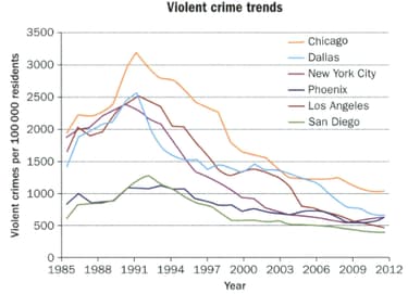
The number of violent crimes per 100000 residents for six large American cities is represented in this multiple line graph.
What is the general trend in violent crime for these cities?
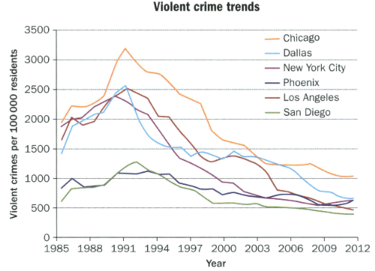
The number of violent crimes per residents for six large American cities is represented in this multiple line graph.
Do you think it is fair to compare these cities in this way? Explain.
The number of violent crimes per residents for six large American cities is represented in this multiple line graph.

The city of San Diego used the graph to advertise. "We have always been one of the safest cities in America". Is that a fair interpretation of the data? Justify your answer
The number of violent crimes per 100000 residents for six large American cities is represented in this multiple line graph.

Suppose the Mayor of Chicago used the graph to explain, 'our violent crime rate has fallen so dramatically that it is now essentially equal to that of other large cities. Would that be a fair interpretation of the
The two graphs shown here represent the same data regarding child labour.
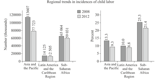
Explain any differences between the graphs.
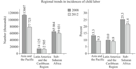
The two graphs shown here represent the same data regarding child labour.

Write a conclusion that would be true for the first graph but not the second one.
The two graphs shown here represent the same data regarding child labour.

Write a conclusion that would be true for the second graph but not the first one.
The two graphs shown here represent the same data regarding child labour.
If you wanted to compare child labour in different regions of the world, which graph more fairly represents the data? Explain.


