
David Weber, Talei Kunkel, Harriet Simand and, Justin Medved Solutions for Chapter: Data Management Trends in Communities, Exercise 7: What makes a good graph?
David Weber Mathematics Solutions for Exercise - David Weber, Talei Kunkel, Harriet Simand and, Justin Medved Solutions for Chapter: Data Management Trends in Communities, Exercise 7: What makes a good graph?
Attempt the practice questions on Chapter 6: Data Management Trends in Communities, Exercise 7: What makes a good graph? with hints and solutions to strengthen your understanding. MYP Mathematics A concept-based approach 1 solutions are prepared by Experienced Embibe Experts.
Questions from David Weber, Talei Kunkel, Harriet Simand and, Justin Medved Solutions for Chapter: Data Management Trends in Communities, Exercise 7: What makes a good graph? with Hints & Solutions

What trends or characteristics do you notice in the data that is being represented?

Do you think this is an effective way to display the information? What aspects about it are effective? What aspects are not so effective? Explain your answers.
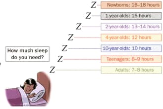
Can you suggest another way to represent this data? Would this new way be better? Explain.
Gender parity is where the percentage of girls enrolled in or attending school is equal to the percentage of boys. This has been reached in primary schools in most countries, but gender parity at the secondary level is still an issue. Use the graphics to answer the question below.

Give a summary (no more than a few sentences) of what this map is showing you.
Gender parity is where the percentage of girls enrolled in or attending school is equal to the percentage of boys. This has been reached in primary schools in most countries, but gender parity at the secondary level is still an issue. Use the graphics to answer the question below.
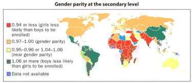
What trends or characteristics in this information stood out when you were first analysing it? Justify your answer.
Gender parity is where the percentage of girls enrolled in or attending school is equal to the percentage of boys. This has been reached in primary schools in most countries, but gender parity at the secondary level is still an issue. Use the graphics to answer the question below.

Could this representation be considered a graph? Give your reasoning.
Gender parity is where the percentage of girls enrolled in or attending school is equal to the percentage of boys. This has been reached in primary schools in most countries, but gender parity at the secondary level is still an issue. Use the graphics to answer the question below.

What aspects of the map are effective in representing the data? What aspects are less effective?
List any five characteristics of a good graph.


