
The students in a school were surveyed about snacks and asked to pick one snack food they liked the most from a list. The bar graph below summarises the data collected from this survey.
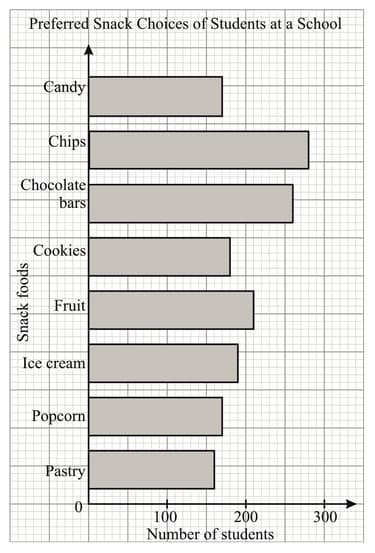
Which snack foods were preferred equally by the students?
Important Questions on Data Handling and Graphs
The bar graph below shows the number of rainy days in a city over a period of four months.
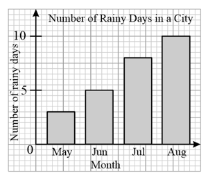
Which month had the least number of rainy days?
The bar graph below shows the number of rainy days in a city over a period of four months.
What is the ratio of the number of rainy days in June to that in August?
The following table shows the examination results in mathematics of class students in a particular school.
| Grade | |||||
| Number of students |
Represent the data using a bar graph.
The histogram below shows the daily wages of some workers in a survey.
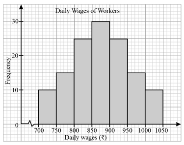
Find the number of workers whose daily wages are not more than .
The histogram below shows the daily wages of some workers in a survey.
Describe the distribution of the daily wages of these workers.
The bar graph below shows Andrew's income and expenditure for each month from January to March.
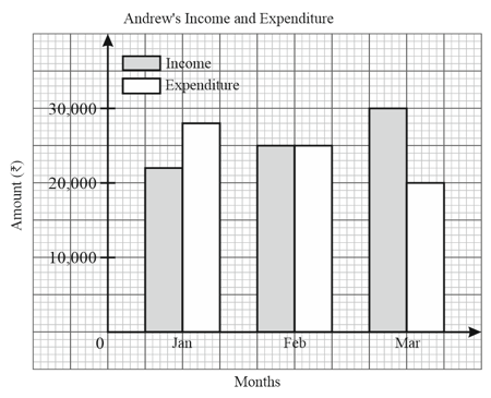
Compare Andrew's monthly income over the three months.
The bar graph below shows Andrew's income and expenditure for each month from January to March.
In which month was his income less than his expenditure and by how much?
The bar graph below shows Andrew's income and expenditure for each month from January to March.
Determine whether his total income in the three months was greater than his total expenditure for the same period.


