
Drawing a Bar Graph
Drawing a Bar Graph: Overview
This topic covers concepts such as Representation of Data, Bar Graphs, and Proper Scale for Plotting Bar Graphs.
Important Questions on Drawing a Bar Graph
A newspaper reporter saw the graph and wrote a headline:
"Survey shows that most students in our town want their parents to do their homework with them." The headline:
If all students had been surveyed and the same fraction had answered "yes","no" and "don't know", the graph would have been looked:


A student who had not been surveyed said," If we had all been surveyed, the results would definitely have been different". Is this statement true?
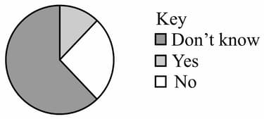
Looking at the graph, the principal said,"The year graph shows that most students want their parents to help them with their project". Is it a true statement of finding?
If a radio station wants a yes/no answer about the popularity of a presenter, which would be the best question to ask?
If you conduct a census survey, it means that you ask:
The frequency table shows the primary favourite colours of the class.
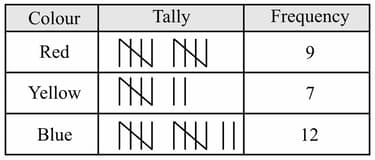
Find the conclusion that can be drawn from that.
To find the favourite colours for your class, it would be best to ask:
Bar graph of the educational trip of the year is given below. With help of it fill in the blanks:
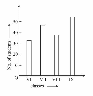
In , the number of students of class _____ was more than .
Draw a bar graph to represent the following data :
|
Game |
Cricket |
Football |
Badminton |
Hockey |
|
No. of players |
27 |
12 |
9 |
18 |
Construct a frequency distribution table for the following data of maximum temperature (in ) using class intervals like (not included).
Draw a histogram for the following data :
|
Weekly wages (in Rs.) |
250-300 |
300-350 |
350-400 |
400-450 |
450-500 |
|
No. of labourers |
35 |
28 |
40 |
33 |
20 |
The number of chocolates in packets are :
.
Make a frequency table taking suitable class size.
The marks obtained by 50 students in a test are as follows. Taking class intervals 11 - 20, 21 - 30 etc. construct a frequency distribution table. Draw a histogram and hence the frequency polygon for the distribution :
48, 46, 53, 35, 64, 50, 45, 56,57, 40, 36, 33, 50, 31, 25, 40,45, 56, 50, 56, 38, 35, 56, 36, 23, 39, 48, 43, 46, 19, 58, 46, 59, 49, 49, 43, 47, 50, 57, 52, 30, 23, 48. 35, 51, 47, 40, 35, 43, 42.
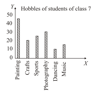
How many more students enjoy photography as compared to crafts?
The width of each of the five continuous classes in a frequency distribution is and the upper class limit of the last class is . The lower class limit of the lowest class is
In a frequency distribution, the mid-value of a class is and width of each class is . The upper limit of the class is
A bar graph is drawn to the scale , then a bar of length represents
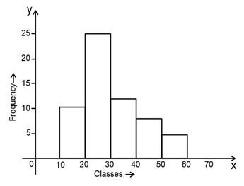
Identify the class whose frequency is ?
The following graph represents the mode of transport used by the people for going to office. Read the graph and answer the following question.
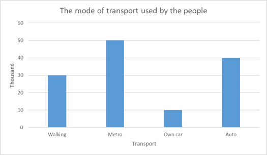
How many people use own car and auto?


