
Basic Graphical Representations
Basic Graphical Representations: Overview
This topic covers concepts, such as, Representation of Data, Tabular Representation of Data, Multiple Line Graph & Comparison Using Multiple Line Graphs etc.
Important Questions on Basic Graphical Representations
Study the following graph carefully and answer the given question. Number of students (Males & Females) passed out from various colleges in a year. (Number in thousands) is shown below:
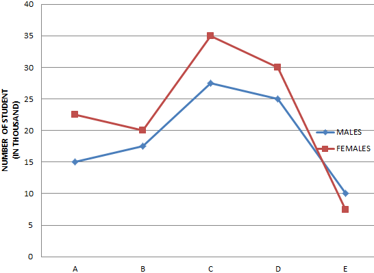
COLLEGES
What is the average number of students (Males & Females) passed out from all the colleges together?
Construct a double bar graph, using the table given below:
Suppose population of India and China are
Construct a double bar graph, using the table given below:
Construct a double bar graph, using the table given below:
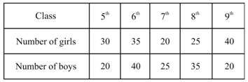
The following table shows the growth in height in terms of the percentage of the full height of boys and girls of their respective ages.
| Age(in years) | |||||||||||
| Boys | |||||||||||
| Girls |
Draw the line graph of given data.
The following table shows the growth in height in terms of the percentage of the full height of boys and girls of their respective ages.
| Age(in years) | |||||||||||
| Boys | |||||||||||
| Girls |
Draw the line graph of given data.
Use the graph to answer the following question:
Who grows faster at puberty ( years to years of age)?
Kiara measured the weight of her dog at the end of every month. She used a line graph to display the data.
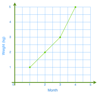
Between which two months did the dog grow the most?
Jane measured the weight of her kitten at the end of every month. She used a pictograph and a line graph to display the data.
| Month | 1 | 2 | 3 | 4 |
| Weight (kg) | 1 | 2 | 3 | 5 |
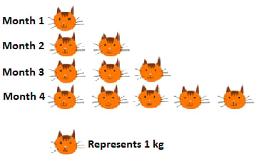

In which two months did the kitten grow at the same rate? Which graph shows this more clearly?
The line graph is given below shows the sales of a shopkeeper in the first week of January .
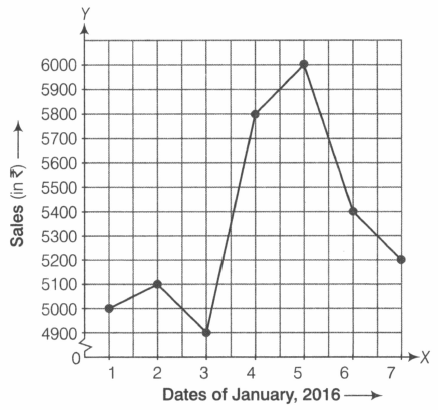
If the cost of one doll is , then how many dolls were sold on January by the shopkeeper.
The following table gives the quantity of petrol and its cost.
| Quantity of petrol (in litres) | 10 | 15 | 20 | 25 |
| Cost of petrol (in ₹) | 500 | 750 | 1000 | 1250 |
The graph given below is showing the above data.
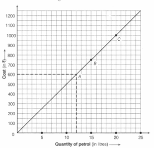
At the cost of , how much petrol do you get?
A study was done to collect data on the amount of homework required from students at a school in Canada.

Should this data be represented in line graph?
A study was done to collect data on the amount of homework required from students at a school in Canada.

What is your prediction for the number of hours of homework that a grade students will have?
A study was done to collect data on the amount of homework required from students at a school in Canada.
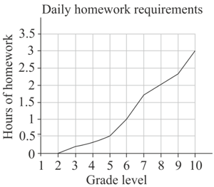
Between which two grades is there the greatest increase in homework requirement?
A study was done to collect data on the amount of homework required from students at a school in Canada.

In what grade are the homework requirements double those in grade ?
A study was done to collect data on the amount of homework required from students at a school in Canada.

In what grade there are no homework requirements?
A study was done to collect data on the amount of homework required from students at a school in Canada.
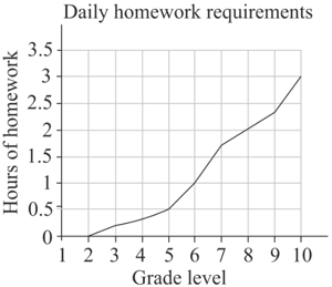
What is the average amount of homework required daily for a grade student?
A study was done to collect data on the amount of homework required from students at a school in Canada.
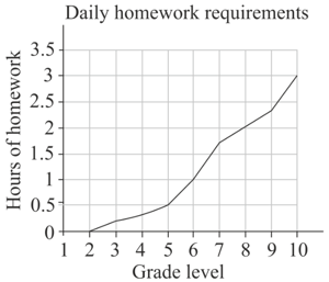
How much the average amount of homework increase in grade ?
This chart was used in an article that claimed, 'High school graduation rates have increased dramatically under new government!'
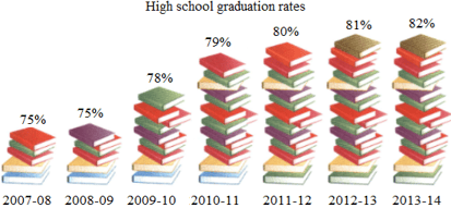
Suppose data on graduation rates were gathered from several decades and represented in this line graph.

How could this graph be used to justify the original conclusion about there being a dramatic increase in graduation rates?
This chart was used in an article that claimed, 'High school graduation rates have increased dramatically under new government!'

Suppose data on graduation rates were gathered from several decades and represented in this line graph.

What in this graph, if anything, is misleading?
Obesity prevalence in youth is represented in this line graph.
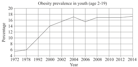
Summarize what the statistics are representing. Is there any information missing?


