
Bar Charts and Histograms
Bar Charts and Histograms: Overview
This Topic covers sub-topics such as Histograms, Bar Graph, Difference between a Histogram and a Bar Graph, Relative Frequency Histogram, Frequency Density Histogram, Understanding Histograms, Modal Class in Grouped Data and, Histograms of Uniform Width
Important Questions on Bar Charts and Histograms
refer the table below and answer the following questions related to the table
The table below has given quarterly statistics on the country's Food grain supply, in '000 tonnes, from the four geographic regions. When the supply from the four geographic regions is unable to meet the consumption demand, the go downs stocks are used to make good the shortfall.
(Figure in the table are in '000 tonnes.)
| MONTH | NORTH | SOUTH | EAST | WEST | GODOWNS | CONSUMPTION |
| Quarter 1 | ||||||
| April | 10 | 20 | 12 | 8 | 50 | 100 |
| May | 15 | 25 | 11 | 10 | 20 | 80 |
| June | 32 | 40 | 23 | 10 | 0 | 82 |
| Quarter 2 | ||||||
| July | 20 | 20 | 25 | 5 | 20 | 90 |
| August | 35 | 38 | 26 | 5 | 0 | 92 |
| Sept | 40 | 30 | 25 | 10 | 0 | 76 |
| Quarter 3 | ||||||
| Oct | 36 | 24 | 40 | 15 | 0 | 80 |
| Nov | 32 | 21 | 20 | 20 | 0 | 82 |
| Dec | 26 | 25 | 12 | 15 | 22 | 90 |
| Quarter 4 | ||||||
| Jan | 21 | 11 | 5 | 5 | 16 | 50 |
| Feb | 26 | 17 | 12 | 10 | 0 | 60 |
| March | 19 | 20 | 15 | 0 | 0 | 49 |
Which region supplied the greatest proportion of food grains consumed during the year?
Study the table and answer the following question.
The frequency distribution of the daily income of workers of a factory is given below:
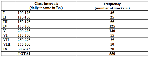
What is the size of class intervals?
Directions: Study the following histogram and answer the following questions.
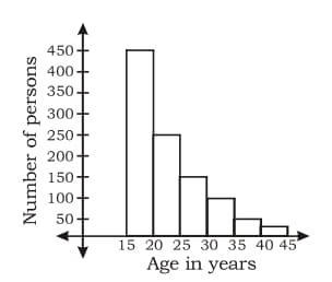
The percentage of population (approximately) in the age group of is:
Directions: Study the following histogram and answer the following questions.

The ratio of the number of persons between the age group of and is :
Which of the graphs is a bar graph and histogram.
What is the difference between histogram and bar graph.
Represent the following data by means of histogram.
| Weekly wages | |||||||
| Number of workers (Frequency) |
In histogram, the _____ of each bar represents the value whereas in bar chart the _____ of each bar represents the values that they represent.
In a factory, there are workers who have been categorised into five groups () on the basis of the range of their daily wages (in multiples of ). The distribution is presented through a Histogram shown below:
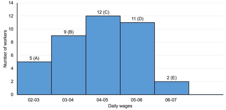
What is the ratio of the number of employees whose daily wages are or more but less than to that of the number of employees whose daily wages are or more but less than ?
Data about the times, in seconds, taken to run metres by adults are given in the following table.
| Time | |||
| No. adults |
By first investigating the possible values of and of find the largest possible value of given that the modal class contains the slowest runners.
Four classes of continuous data are recorded as and The class has a frequency of and there is no modal class. Find the total frequency of the other three classes.
A railway line monitored of its August train journeys to find their departure delay times. The results are shown below. It is given that of these journeys were delayed by less than minutes.
Find the total number of journeys provided in August.
A railway line monitored of its August train journeys to find their departure delay times. The results are shown below. It is given that of these journeys were delayed by less than minutes.

Calculate an estimate of the number of these journeys that were delayed by:
to minutes.
The masses, grams, of medical samples are given in the following table.
| Mass ( grams) | |||
| No. medical samples |
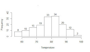
The histogram shows the lengths of black rats.
The modal class is
Height in cms:
No. of students:
Modal group is
Coronavirus disease (COVID) is an infectious disease caused by the SARS-CoV virus.
Most of the people who got infected with this virus have experienced mild to moderate respiratory illness and recovered soon. But, some people have become seriously ill and required medical attention. Older people who have other medical conditions like diabetes, chronic respiratory disease, or cardiovascular disease etc. will be infected easily and develop serious illness. Anyone, at any age, can get sick with Coronavirus and become seriously ill or die.

During a survey, the ages of patients who are infected and admitted in a city hospital are recorded. The data is represented using the histogram as show below:

The class width of the given data is
Coronavirus disease (COVID) is an infectious disease caused by the SARS-CoV virus.
Most of the people who got infected with this virus have experienced mild to moderate respiratory illness and recovered soon. But, some people have become seriously ill and required medical attention. Older people who have other medical conditions like diabetes, chronic respiratory disease, or cardiovascular disease etc. will be infected easily and develop serious illness. Anyone, at any age, can get sick with Coronavirus and become seriously ill or die.

During a survey, the ages of patients who are infected and admitted in a city hospital are recorded. The data is represented using the histogram as show below:
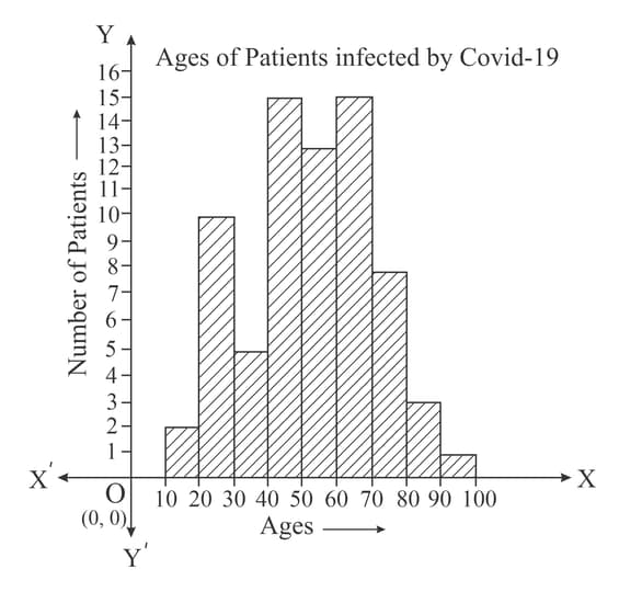
The age group of the highest number of patients infected by Covid is
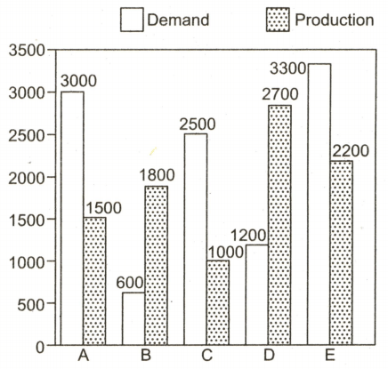
Study the graph carefully and answer the given question.
The graph shows the Demand and Production statistics of the five companies.
What is the difference between the average demand and the average production of five companies taken together?


