
Bar Graphs
Bar Graphs: Overview
This topic covers concepts, such as, Data Handling, Graphical Representation of Data, A Pictograph of Data, A Bar Graph of Data & A Double Bar Graph of Data etc.
Important Questions on Bar Graphs
This chart was used in an article that claimed, 'High school graduation rates have increased dramatically under new government!'

Explain how your conclusion is different than the original.
This chart was used in an article that claimed, 'High school graduation rates have increased dramatically under new government!'
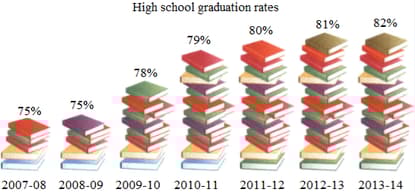
Draw a bar graph of this data and write down a conclusion that could be drawn from your new graph.
The following bar shows the number of family members in a house in a particular society.
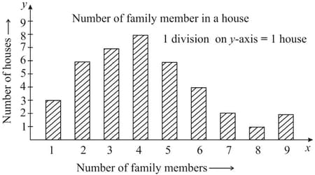
How many houses have 6 family members?
The following bar shows the number of family members in a house in a particular society.
What is the highest number of family members that are living in a house?
Represent the following data using a bar graph and
Answer.
Which animal has the longest life span?
Which animal has the shortest life span?
| Animal | Life Span |
| Lion | 25 years |
| Tortoise | 200 years |
| Elephent | 60 years |
| Cat | 15 years |
| Man | 80 years |
Represent the data given below in the form
Of a bar graph
| Year | Number of Units Produced |
| 1999 | 300 |
| 2000 | 450 |
| 2001 | 500 |
| 2002 | 320 |
| 2003 | 470 |
| 2004 | 550 |
| 2005 | 610 |
The following table shows the life expectancy (average age to which people live) in various countries in a particular year.
| Country | India | Japan | Britain | Ethiopia | Cambodia |
| Life expectancy (in years) | 65 | 80 | 75 | 50 | 45 |
Represent the above data by a bar graph.
The air distances of four cities from Delhi (in km) are given below:
| City | Mumbai | Kolkata | Hyderabad | Channai |
| Distance from Delhi (in km) | 1100 | 1340 | 1220 | 1700 |
Draw a bar graph to represent the above data.
The following table shows the favorite sports of students of a school.
| Sports | Cricket | Badminton | Football | Tennis | Swimming |
| No.of Students |
Represent the above data by a bar graph.
The following table shows the year-wise strength of a school.
| Year | 2010-11 | 2011-12 | 2012-13 | 2013-14 | 2014-15 |
| No. of students | 950 | 1125 | 1400 | 1750 | 1900 |
Represent the above data by a bar graph.
The marks of a student in different subjects are given below:
| Subject | English | Hindi | Mathematics | Science | Social science |
| Marks |
Draw a bar graph from the above information.
The double bar chart shows import and export of a country between and in hundred crores of its currency. Study the graph and answer the question given below.
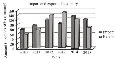
In which years were the exports lower than the imports and by how much in all
The bar graph represents information about the number of students admitted to various courses in a college. Study the graph and answer the given question.
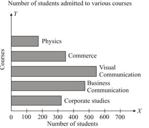
How many students were admitted to course in physics?
Classify the following data as primary or secondary data.
Literacy rates of different states, obtained from government published reports.
Classify the following data as primary or secondary data.
Election results of different political parties obtained from television.
The frequency table shows the number of passengers in each of the taxis that were inspected during a police road block. Find the value of 'x'.
| Number of passengers | |||||
| Number of taxis |
A bar graph is drawn to the scale of . The length of the bar representing a quantity is . Find .
There is given a frequency distribution of monthly wages of workers in an organisation
| Monthly wages (in ) | Number of workers |
| Total |
.Draw the histogram from the above table.
The marks obtained by students of class VIII in an examination are given below:
Represents the data in the form of a frequency distribution using the same class size, one such class being (where is not included).
The marks obtained by Kunal in his annual examination are shown below:
| Subjects | Hindi | English | Mathematics | Science | Social studies |
| Marks obtained |
Draw a bar graph to represent the above data.


