
The infographic shows information about cars.

What percentage () of people do not always wear their seat belt?
Important Questions on Interpreting Results
The infographic shows information about cars.

What percentage () of people got their first car when they were years old?
The infographic shows information about cars.

What percentage (%) of people have never owned a car?
The infographic shows information about cars.

At what age it is most popular for people to get their first car?
The infographic shows information about cars.

Which country has cars per people?
The infographic shows information about cars.
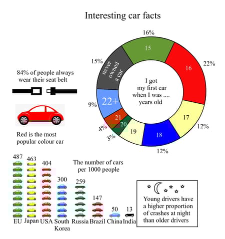
Which country listed on the chart has the least number of cars per people?
Look at the given statement. Which type of diagram, graph or chart do you think is the best to use to display the data. Justify your choice.
The number of ice-creams sold in a shop each day for one week.
Look at the given statement. Which type of diagram, graph or chart do you think is the best to use to display the data. Justify your choice.
The height and the shoe size of students.
Which type of diagram, graph or chart do you think is the best to use to display the data. Justify your choice.
The total number of cakes, sandwiches and drinks sold in a cafe on two different days.


